
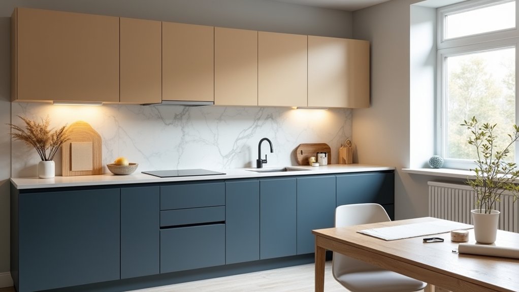
Like the sleek, pared-back kitchens you’d spot in a Scandi showroom, you can modernise yours with a considered palette and pro-level prep. You’ll start by choosing cool greys, warm neutrals, or a single confident accent, then map out a two-tone plan that suits UK light and layout. You’ll degrease, sand, and mask for crisp lines, then prime and finish in a durable water-based enamel—if you get one step wrong, though, everything shows…
Key Takeaways
- Build a modern palette from key finishes (quartz, oak, brass, chrome, matt black) and match undertones under daylight and LEDs.
- Use two-tone cabinets: darker lowers, lighter uppers, with a 20–30% tonal contrast for depth and balance.
- Place bold accents on focal zones (island, splashback, pantry door) and keep large surfaces in warm neutrals like putty or soft white.
- Prep like a pro: degrease, sand, fill chips, dust off, and mask cleanly to ensure primer bonds and lines stay crisp.
- Choose durable satin cabinet paint, spray or brush-roll carefully, then cure 7–14 days before refitting hardware and cleaning gently.
Choose a Modern Kitchen Palette for Your Finishes
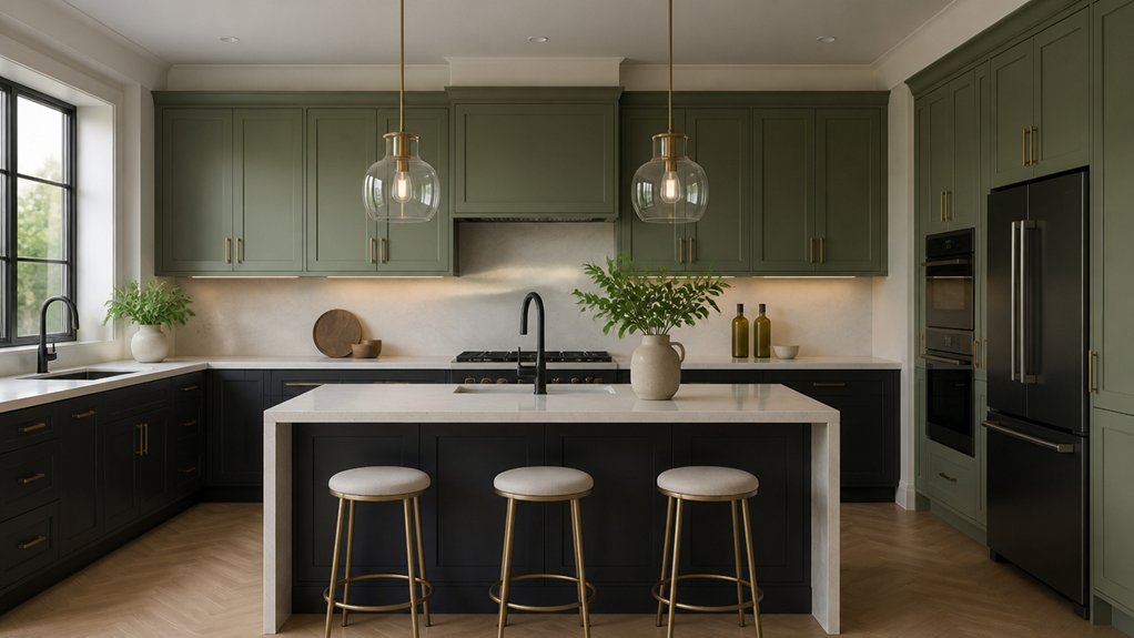
If you want your kitchen to feel current rather than cookie-cutter, start by choosing a modern palette that suits your finishes as much as your lifestyle. Take stock of what’s staying: quartz, oak, brushed brass, chrome, terrazzo, or matt black.
Then pick colours that flatter undertones—cool greys can fight warm oak, while soft greige and clay harmonise beautifully. If you’ve got stainless appliances, lean into crisp whites, ink blues, or Monochrome schemes with layered textures (ribbed glass, microcement, satin paint).
For brass taps and handles, try deep green, oxblood, or warm off-white. Keep sample pots under UK daylight; north-facing rooms read bluer.
Add Vintage accents through aged tiles or smoked hardware, not fussy shades.
Try Two-Tone Kitchen Cabinets (Rules That Work)
Go two-tone with your kitchen cabinets by pairing complementary shades—think warm greige with inky navy, or soft sage with crisp off-white—for a look that feels current in UK homes.
Keep it balanced by running the deeper tone on the lower units to ground the space, then lift the uppers with a lighter colour for brightness.
If you’re unsure, echo one cabinet tone in your worktop, splashback, or handles so the scheme reads intentional rather than split.
Choose Complementary Colour Pairings
While a single shade can look sleek, complementary colour pairings give your kitchen a more modern, designed-in feel—especially with two-tone cabinets. Start with a hero hue you love (ink navy, sage, clay, or charcoal) then choose its partner by undertone: warm meets warm, cool meets cool.
In UK light, muted pairings read premium—try olive with putty, navy with soft stone, or terracotta with warm white. Use colour psychology to steer mood: greens calm, blues sharpen, earthy tones feel sociable.
Keep finishes intentional: matte for depth, eggshell for wipeability, satin on feature areas. If you’re adding Accent walls, echo one cabinet tone so the scheme feels cohesive, not competing.
Sample large boards under daylight and LEDs.
Balance Upper And Lower Tones
Because most UK kitchens sit under changeable daylight and warm LED spots, two-tone cabinets work best when you balance visual weight: keep uppers lighter to lift the room, and anchor the run with deeper lowers (or an island) so it feels tailored rather than top-heavy.
Start by sampling paint beside your lighting fixtures at breakfast, midday, and evening; cooler north light can flatten greys, while spots can yellow whites. Aim for a 20–30% tonal jump between tiers: think soft oat above and inky green or charcoal below for that London-newbuild polish.
If you’ve got tall larders, treat them as “lowers” to keep the base grounded. Finish the look with consistent hardware finishes—brushed brass warms, black nickel sharpens—so the split feels intentional.
Add High-Contrast Accents Without Overdoing It
To add high-contrast accents without the kitchen feeling shouty, you’ll get the best results by picking strategic zones—think an island base, a tiled splashback, or a run of tall units—rather than scattering dark notes everywhere.
You then keep the look current in UK homes by anchoring those hits of black, deep green, or inky blue with warm neutrals like putty, oat, or soft white on the bigger surfaces.
That balance lets the contrast read intentional and modern, not busy.
Choose Strategic Accent Zones
- Paint the island base or breakfast bar front for an instant focal point.
- Define a chimney breast, niche, or pantry door with a saturated hue.
- Add a slim band on skirting, window reveals, or shelving backs for tailored edge.
Keep edges crisp with low-tack tape and a fine brush cut-in for joinery.
Balance Contrast With Neutrals
While high-contrast kitchens look sharp in magazines, they can feel busy fast in real UK homes, so you’ll get a cleaner, more expensive finish by anchoring bold hits with well-chosen neutrals.
Start with warm greige, soft oat, or a chalky off-white on most walls, then layer contrast on one or two elements only—an island base, tall pantry doors, or a splashback frame.
Use Color psychology: deep navy or forest green reads calm and premium, while black feels graphic and modern but needs daylight.
Keep trims and ceilings a consistent neutral to protect design harmony.
Repeat the accent colour in small touches—stools, handles, or rail art—so it looks intentional, not chaotic.
Clean, Sand, and Mask for Pro Paint Prep
Before you even open a tin of paint, get your kitchen surfaces properly prepped: degrease every cabinet and trim with a sugar soap or specialist kitchen cleaner, then lightly sand to knock back the sheen so primer can bite. This Surface preparation step is what separates a quick refresh from a durable, showroom finish in busy UK homes.
Wipe away dust with a tack cloth, then mask like you mean it: crisp lines around worktops, tiles, sockets, and hinges keep your modern colour blocks looking intentional.
- Label doors and bag screws so reassembly’s painless
- Use low-tack masking tape plus masking paper, not newspaper
- Feather chips and fill dings, then sand flush for flat light catch
Nail these basics and your paint application techniques will look sharper, cleaner, and more contemporary.
Pick the Right Primer for Cabinets and Walls
Once you’ve dulled the gloss and cleaned off every trace of grease, the primer you choose decides whether your modern colour scheme stays crisp or starts chipping at the kettle-and-toaster stage.
For cabinets, go for a high-adhesion bonding primer that grips melamine, laminate, or previously varnished timber—ideal for busy UK kitchens with steam and splashes. If you’re covering knots or tannin bleed, use a stain-blocking primer to stop yellowing under pale greige, clay, or soft sage trends.
For walls, your wall preparation should include a mist coat on fresh plaster, while existing painted surfaces often need a stabilising primer if they’re chalky or powdery.
Keep primer selection low-VOC for indoor air quality, and tint it towards your top colour to avoid patchiness.
Choose the Best Cabinet Paint and Sheen
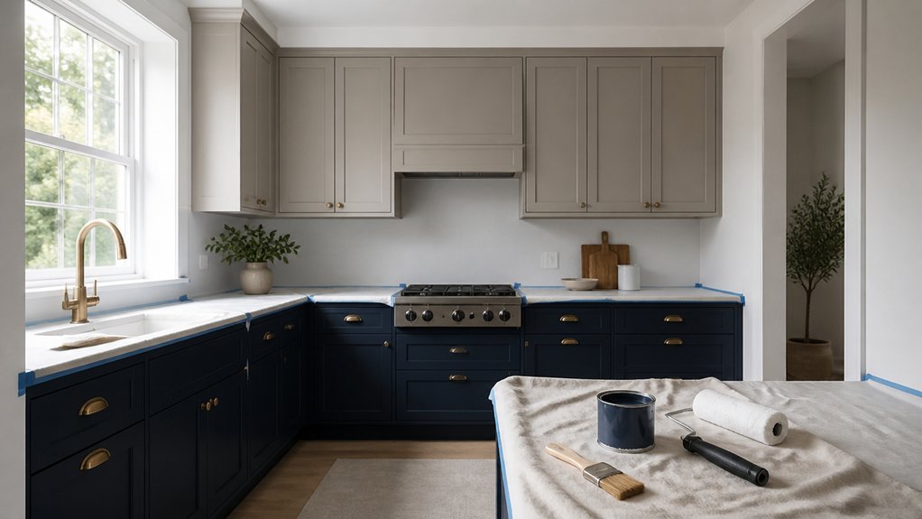
If you want your modern colour scheme to look sharp under UK kitchen lighting and survive daily wiping, choose a cabinet-specific paint that levels well and cures hard. In British homes, hybrid water-based enamels and premium acrylic-alkyds give you pro results without the lingering odour of old-school solvent gloss.
- Go satin for the current “soft sheen” look; it hides micro-scratches better than full gloss and feels more premium than matt.
- Choose a washable, stain-resistant formula with high paint durability, especially around hob splash zones and bin cupboards.
- Match sheen to cabinet hardware: brushed brass pops against satin deep green; black handles look crisp on muted greige.
Check drying and full-cure times on the tin, so you don’t mark doors during reinstalling.
Decide: Spray or Brush-Roll Cabinet Paint
You’ve picked the right cabinet paint and that on-trend satin sheen; now the finish quality comes down to how you apply it—spraying for that factory-smooth look on modern slab doors, or brush-and-roll for a controlled, low-mess setup that still reads premium in a typical UK kitchen.
If you’ve got access to HVLP and a dust-free space, spraying levels colour fast, minimises texture, and suits handleless, flat-front runs where light rakes across every panel.
Choose brush-and-roll when you’re working in-situ, want easy masking, and need predictability around hinges, rails, and tight corners. Use a microfibre mini roller for panels and a quality synthetic brush for profiles, keeping strokes aligned.
Match your paint application techniques to traffic levels for cabinet durability.
Cut In Cleanly, Cure Properly, and Protect Paint
Although your colour choice sets the mood, crisp cut-ins, proper cure time, and a few smart protective habits keep modern kitchen paintwork looking showroom-sharp in real UK use. Use a quality angled brush for edges, then seal lines with low-tack painter’s tape; burnish lightly so you don’t pull fresh paint.
Keep Color harmony by matching trim sheen and undertones to your cabinet colour, especially under cool LED task lighting.
- Cut in first, then roll/spray while edges are wet for seamless blends.
- Let paint cure 7–14 days before refitting doors, bumpers, and handles.
- Protect high-touch zones with felt pads, soft-close buffers, and gentle cleaners (no bleach or scourers).
Finally, crack windows or run extraction; steady airflow speeds curing without dusting.
Conclusion
You’ve turned your kitchen into a modern backdrop, where cool greys, soft neutrals, or a bold accent land like a perfectly placed pendant light. You’ve balanced two-tone cabinets with high-contrast touches, keeping the look sharp, not shouty. With proper degreasing, sanding, and crisp masking, your finish reads bespoke. Choose the right primer, then a tough hybrid enamel in a satin sheen. Spray or brush-roll, let it cure, then treat it gently.
About the Author