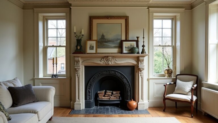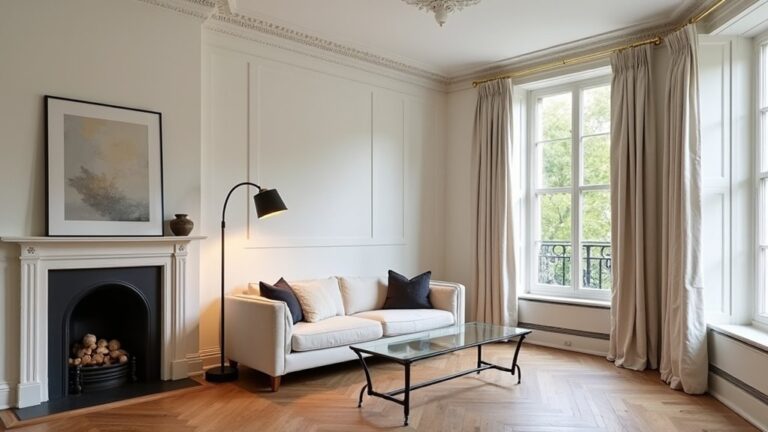
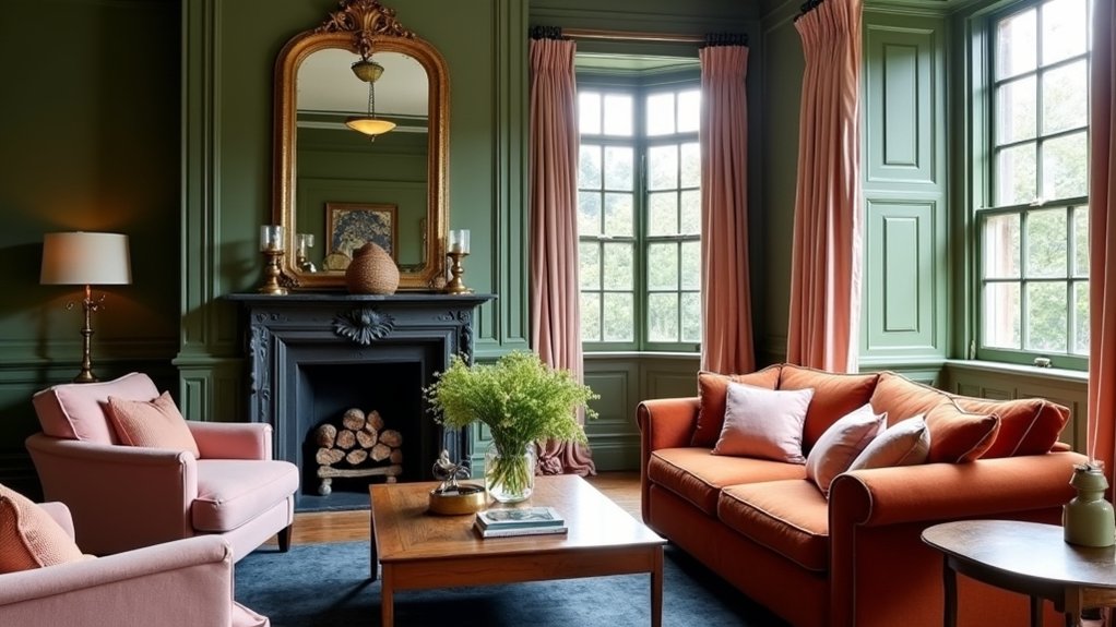
You can transform a Victorian living room by using colour psychology as a practical tool, not a trend. Start by judging your light direction and the room’s original features—bay windows, cornices, stained wood—because they change how colour behaves. Warm, muted shades can make the space feel secure and sociable, while cool neutrals sharpen detail and add contemporary value. But the real shift happens when you place colour with intent…
Key Takeaways
- Map daylight by room orientation and test swatches morning to evening, because Victorian light shifts strongly change colour perception.
- Choose a three-colour mood palette: dominant wall colour, lighter ceiling/trim tone, and deeper accent to control emotion and cohesion.
- Use colour psychology deliberately: green calms, navy adds seriousness, oxblood feels warm and prestigious, and ochre reads sociable and welcoming.
- Adjust perceived proportions with placement: lighter ceilings lift height, and matching trims to walls reduces cut lines to widen narrow rooms.
- Layer lighting to reinforce mood: 2700K warm lamps for cosy, bounce light for airy, and directional spots for dramatic depth around period details.
Assess Light Direction in Your Victorian Living Room
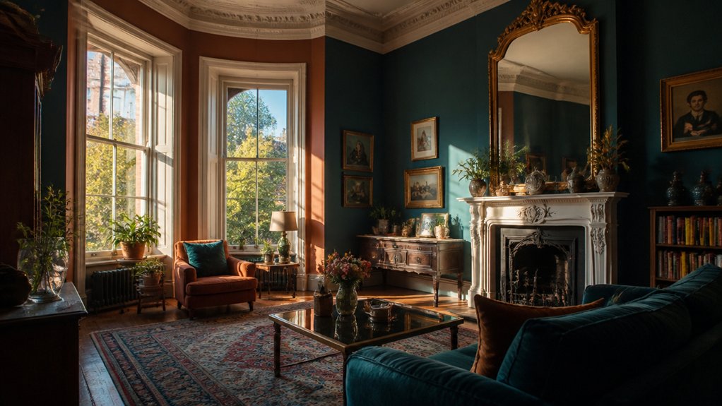
Because Victorian rooms were often designed around daylight rather than ceiling fixtures, you’ll get more accurate colour results if you first map how light enters the space: note whether your living room faces north, south, east, or west, and observe morning, midday, and late-afternoon conditions.
North light skews cool and can flatten warm pigments; south light intensifies saturation and can make creams read yellower. East light brightens early, then cools; west light warms late and can over-emphasise reds.
Log paint swatches on the wall, not in your hand, and view them beside original features like timber, tile, and marble. Then test artificial lighting: note bulb kelvin, CRI, and shade materials, because LEDs can shift undertones and affect perceived value.
Photograph results for consistent comparison later.
Pick the Mood: Cosy, Airy, or Dramatic
Now that you’ve assessed your Victorian living room’s light direction, you can pick a mood palette—cosy with warm, muted heritage tones, airy with lighter tints and clean neutrals, or dramatic with saturated hues and inky accents.
Colour-perception research and period precedent both suggest you’ll get the most convincing result when your undertones match the era’s materials (wood, plaster, brass) and today’s buyer expectations for comfort and brightness.
Balance light and shadow by anchoring the room with deeper values in recesses and trims, then lifting the main planes with higher-LRV paints so the mood reads intentional from day to night.
Define Your Mood Palette
Before you browse paint decks or save another inspo photo, decide what emotional tone you want the room to deliver, since colour consistently shifts how warm, open, or intense a space feels across lighting conditions and times of day.
Start with a three-colour “mood palette”: a dominant wall hue, a supporting trim/ceiling tone, and a deeper accent for joinery or textiles.
For cosy, choose heritage reds, ochres, or olive—Color symbolism cues hearth, comfort, and tradition, and research links warmer hues to greater perceived intimacy.
For airy, lean into soft stone, pale sage, or chalky blue; their lower saturation reduces visual noise and supports calm.
For dramatic, pick inky green, oxblood, or charcoal, then pair with brass and dark woods to echo Victorian richness while staying saleable.
Balance Light And Shadow
A three-colour mood palette sets the emotional brief, but light and shadow decide whether it actually reads as cosy, airy, or dramatic once the sun moves and lamps switch on.
In a Victorian living room, cornices, ceiling roses, and chimney breasts exaggerate contrast, so test your paint at morning and dusk.
For cosy, layer warm lighting techniques: 2700K lamps, shaded table lights near seating, and a dimmable picture light to soften edges.
For airy, bounce light: higher LRV wall colours, pale ceilings, and uplighters that wash cornices, reducing shadow play in alcoves.
For dramatic, embrace directionality: narrow-beam spots on artwork, a single statement pendant, and darker trims to deepen reveals.
You’ll protect period detail and create a sellable, photograph-friendly mood.
Build a Victorian Living Room Palette That Fits
Because Victorian interiors balanced saturated colour with visual order, you’ll get the most convincing living room palette by anchoring it in one dominant hue—deep green, oxblood, navy, or ochre—then supporting it with warm neutrals and controlled contrast.
Start with evidence: study Historical colour palettes from paint archives and house-museum schemes, then match undertones to your room’s daylight.
Use Victorian colour symbolism to guide mood and spend: green reads stability and intellect, oxblood signals warmth and status, navy suggests seriousness, ochre adds sociability.
Keep contrast intentional—pair your anchor with two related supporting shades and one accent (brass, ebonised wood, or muted terracotta) rather than many brights.
For resale-friendly cohesion, repeat the anchor in soft furnishings and art, not every surface.
Modernise Victorian Features With the Right Neutrals
To modernise Victorian features without erasing their character, you’ll get better results with neutrals that balance warm and cool undertones, since perception studies show undertone harmony reduces visual clutter.
Choose warm off-whites and soft greiges to flatter timber, brass, and original plasterwork. Then use cooler stone or putty shades to sharpen cornices, ceiling roses, and joinery.
You’ll keep period details legible and upgrade the look to today’s market expectations without tipping into stark, heritage-inauthentic white.
Balancing Warm And Cool
Although Victorian rooms often lean warm thanks to timber floors, aged plaster, and ornate mouldings, you can modernise those features by balancing warm and cool undertones in your neutrals. Start by sampling greige, mushroom, or putty on walls, then pair them with a cooler off-white on ceilings to sharpen cornices without making the room feel sterile.
Use evidence-backed colour psychology: cooler notes calm, warmer notes invite, and mixing both boosts perceived brightness in north-facing rooms. Build Complementary colour schemes by offsetting warm oak with blue-grey upholstery or a charcoal rug.
Let Texture and pattern choices do the heavy lifting: matte paint against polished brass, nubby linen beside smooth marble, and restrained geometrics to keep the look current.
Neutrals For Period Details
Once you’ve balanced warm and cool undertones, the next win comes from choosing neutrals that flatter Victorian detail without freezing it in time.
Start with off-whites that carry a hint of ochre or grey; they soften cornices and ceiling roses while keeping daylight bounce high. Use greige or putty on walls to calm busy mouldings and patterned floors. Then pick a deeper neutral—smoked taupe, charred stone, or inky brown—for skirting and joinery to sharpen profiles.
This approach respects Victorian colour history, where “neutral” often meant complex, pigmented earths rather than flat white. For market appeal, keep Neutral colour schemes layered: three related values, matte on plaster, satin on wood.
You’ll modernise features, not erase them.
Place Colour on Walls, Ceiling, and Trims
Because your eye reads colour as a series of connected planes, where you place it—walls, ceiling, and trims—changes a room’s perceived height, width, and brightness as much as the hue itself.
If your Victorian living room feels low, keep the ceiling lighter than the walls; research on luminance shows brighter overhead planes read as higher.
For cosy grandeur, try ceiling contrast: a soft tint above richer walls to emphasise cornices without shrinking the space.
Use trims strategically: painting skirting and architraves to match walls reduces visual “cut lines” and can widen narrow rooms—handy for terraces.
Want drama without risking resale? Choose an Accent wall on the chimney breast; it respects the period focal point and limits commitment.
Keep finishes matte for authenticity.
Coordinate Wallpaper, Woodwork, and Furniture Colours
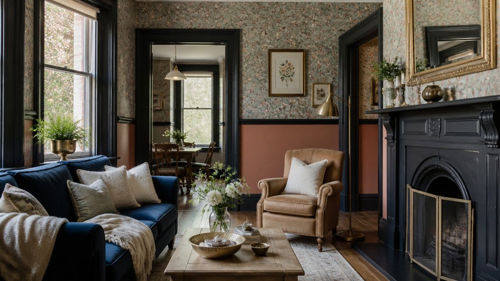
After you’ve decided which planes get colour, the next lever is how wallpaper, woodwork, and furniture interact in the same sightline. In Victorian rooms, busy wallpaper patterns were common, so treat them as your “dominant” and keep woodwork either clearly lighter or clearly darker for legibility.
Use historical cues: deep olive, oxblood, or indigo grounds suit period papers, while off-white or tinted stone trims feel authentic in later Victorian schemes.
Anchor the palette with one repeatable tone pulled from the paper into skirting, cornice, or a picture rail—research shows repetition boosts perceived cohesion. Then add Furniture accents in controlled doses: a mahogany sideboard, brass pulls, or a velvet chair that echoes the wallpaper’s secondary hue, not its loudest note.
Conclusion
When you assess your room’s light, choose a clear mood, and build a period-respectful palette, you don’t just decorate—you steer how the space feels. Use warm, muted hues for comfort, cool greiges to lift and modernise, and place colour deliberately on walls, ceilings, and trims to showcase Victorian detail. Tie wallpaper, woodwork, and furnishings together with repeated tones and brass or velvet accents. Get this right, and you’ll feel at home, come rain or shine.
About the Author