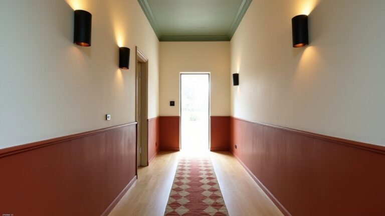
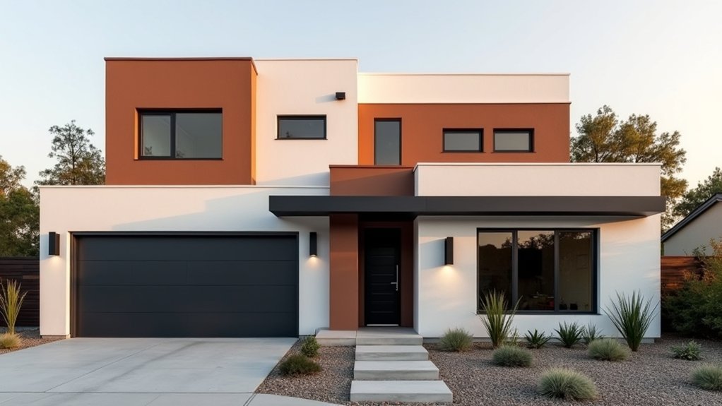
Modern colour blocking can make an average UK façade look newly detailed without adding any building work. You start by walking the elevation and spotting paintable zones—render, brick, soffits, lintels, reveals, frames—then you set hard boundaries with masking and caulk for crisp, low-noise lines. You keep a neutral base and push contrast only where the architecture needs definition. The key choice comes next: where you stop one colour and start another…
Key Takeaways
- We mapped every paintable façade zone and aligned colour breaks to material changes, joints, and trim depth for crisp, architectural blocking.
- We chose a restrained palette: one dominant neutral base plus one bold accent and a trim note to sharpen lines without clutter.
- We tested swatches in shade and full sun to avoid surprise undertones, especially under UK overcast light and shifting daylight.
- We masked and caulked meticulously, keeping reveals and window boxes within one block, so cut lines stayed straight and modern.
- We refined the finish with coordinated hardware, masked hinges, and stainless screws, reducing visual noise and improving durability.
What Modern Exterior Colour Blocking Means?
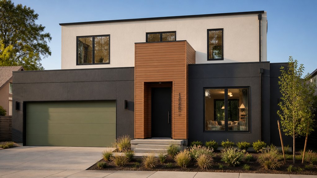
Although colour blocking started as an interior and fashion trope, modern exterior colour blocking means you’re deliberately breaking your façade into clean, architectural zones and assigning each a distinct, high-contrast shade—typically a dominant base colour plus one or two accents—to sharpen lines, rebalance proportions, and make features like bays, porches, window reveals, and cladding panels read as intentional elements rather than background.
You’ll treat colour like detailing: specify crisp cut lines, align breaks to joints, and use matt or low-sheen finishes to reduce glare in UK light.
Historical influences matter—think Bauhaus geometry, mid‑century civic blocks, and British seaside palettes—yet you’ll filter them through current cultural trends such as Scandi minimalism and bold Dopamine Décor.
You’ll also consider LRV contrast for legibility, and choose durable, breathable systems suited to masonry and render.
Walk Your Exterior and Note Paintable Zones
Before you pick a palette, walk the whole exterior—front, sides, and rear—and map every paintable “zone” so your colour breaks land on real architectural lines rather than guesswork. Take a clipboard (or phone) and mark changes in material, plane, and trim depth: render to brick, bay projections, soffits, fascias, and downpipes.
Note sun paths and prevailing rain; UK elevations weather differently, so zones should follow exposure. Check how planting, paving, and boundary walls affect landscape integration, especially where hardscape meets plinths. Treat window framing as its own zone: sills, reveals, and lintels often read differently from the main wall.
- Render panels, brick courses, and plinth lines
- Fascias, soffits, gutters, and rainwater goods
- Door surrounds, porch ceilings, and window framing
Choose a Modern Exterior Colour-Blocking Palette
Once you’ve mapped your paintable zones, lock in a modern colour-blocking palette that works with UK light, local context, and the materials you can’t change.
Start by sampling in north-facing shade and full sun; British overcast can flatten chroma, so choose mid-tone neutrals (warm greige, putty, soft charcoal) with one confident accent.
Use Color psychology: deep blues and greens read calm and premium; oxblood and saffron feel heritage with a contemporary edge; black signals sharp modernity but can look harsh on small façades.
Let material textures steer sheen and undertone—brick wants muted, mineral paints; render takes cleaner pastels; timber cladding suits richer stains.
Keep to two to three hues plus a metal-compatible trim note.
Set Colour-Block Boundaries on Doors, Trim, Siding
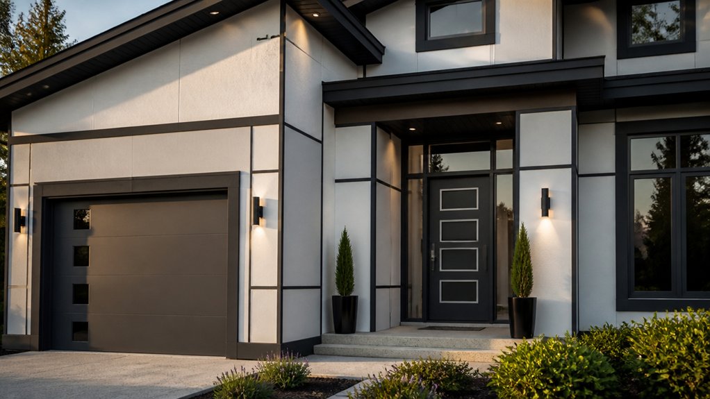
Because colour blocking looks only as sharp as its edges, you should set hard boundaries on doors, trim, and siding using existing architectural breaks rather than arbitrary tape lines. Use the door stop, architrave returns, soffit lines, and corner boards as your cut points, so blocks read intentional on UK brick-and-render façades.
Treat Door accents as discrete “insets” within the leaf and frame, not a spill onto surrounding masonry. For Siding accents, align colour changes to plank courses, starter strips, and window head flashings to avoid awkward half-boards.
- Map elevations and mark breaklines before you buy paint
- Mask to junctions (mastic lines, beads, trims), not mid-panel
- Keep reveals, vents, and meter boxes within one colour block
Use Contrast to Emphasize Exterior Architecture
You’ll use high-contrast colour blocks to pick out key façade lines—lintels, bays, parapets, and reveals—so the architecture reads crisply from the street.
Pair a lighter field colour with darker trim or cladding zones to control perceived depth and make openings and projections pop.
Keep the light–dark massing balanced across elevations so your home looks intentional, not top-heavy, in typical UK daylight.
Highlight Key Facade Lines
When you apply colour blocking with deliberate contrast, you can trace the facade’s strongest lines and make the architecture read cleaner from the street. Start by mapping where shadow breaks already define edges, then paint to reinforce those cues.
You’ll sharpen Facade symmetry by keeping opposing elements in the same tonal family while outlining junctions in a crisp counter-colour. For roofline integration, carry the upper band through fascia, gable returns, and soffits so the silhouette feels intentional, not patched.
- Pick one “line colour” for reveals, trims, and corner beads to unify details
- Use a matte finish on broad planes, satin on edges to catch UK daylight
- Align blocks to window heads/sills and downpipe runs for tidy datum lines
Balance Light Dark Massing
Once you’ve used crisp line colours to clarify trims and junctions, shift focus to the bigger read: how light and dark blocks distribute visual weight across the elevation.
Treat the façade like a section drawing: darker tones visually “recede” and can slim bulky volumes, while lighter fields lift and widen. In UK streetscapes, keep the darkest massing to plinths, recesses, and garage doors to ground the house and reduce perceived height.
Use Lighting contrast deliberately: site a deep charcoal behind glazing to sharpen reveals, then carry a warm off-white across projecting bays to catch daylight.
Let Material textures do the heavy lifting—matte masonry absorbs, satin cladding reflects—so your blocks read clean in rain, shade, and low winter sun.
Test Exterior Colour Blocks in Real Daylight
Although digital renderings can guide your palette, real UK daylight will expose undertones and contrast shifts that screens can’t replicate. Paint A3 test squares on each façade plane and check them morning, noon, and blue-hour, because cloud cover and wet brick bounce colour differently in Britain.
Use Color psychology to predict how a warm off-white lifts kerb appeal, while a deep green calms a street-facing mass. Respect historical influences too: Edwardian red brick, slate, and stone coping will push modern pastels cooler.
- View samples in sun, overcast, and rain to catch metamerism
- Stand at pavement distance to judge block proportions
- Photograph in RAW so you can compare hue and value objectively
Paint Crisp Lines for Clean Colour Blocking
Because colour blocking lives or dies on its edges, you’ll need to set out razor-straight lines before the first coat goes on. Snap a chalk line on render, then mark junctions with a soft pencil on timber or brickwork.
Choose high-tack or delicate-surface masking tape to suit the substrate, and keep it dead level with a spirit level. Your tape application methods matter: burnish the edge with a putty knife, then seal it with the base colour to stop bleed.
When you cut in, use brush edge techniques—load only the first third of the bristles and pull in one steady pass, keeping the ferrule clean.
Work in cool, dry UK conditions, and peel tape back on itself while paint’s still green.
Finish With Trim, Front Door, and Fixtures

When the main colour blocks have cured, tighten the whole elevation by treating the trim, front door, and fixtures as a coordinated “hardware layer” rather than afterthoughts. You’ll lock in the geometry and make the scheme read intentional from the kerb.
- Pick Trim accents in a satin or eggshell (10–20% sheen) to frame edges without glare in changeable UK light.
- Paint the front door in a deeper tone from the palette; use a high-build exterior enamel for knock resistance and wipe-clean durability.
- Standardise fixture finishes—letterplate, knocker, house numbers, porch light—in one metal (black, brushed brass, or stainless) to stop visual noise.
Keep caulking neat, mask hinges, and swap tired screws for stainless. You’ll get a sharper, more contemporary colour-blocked façade.
Conclusion
You’ve seen that modern exterior colour blocking isn’t just paint; it’s a disciplined way to zone the façade, sharpen lines, and reduce visual clutter. By mapping paintable areas, setting crisp boundaries, and pairing a neutral base with high-contrast accents, you make lintels, reveals, and frames read with intent. Test in real UK daylight, then mask, caulk, and cut in cleanly—because precision isn’t optional, it’s the finish.
About the Author