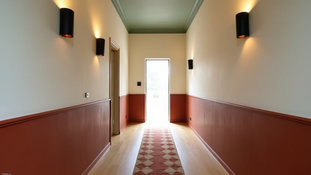
You probably don’t know that the most effective hallway colour zoning starts with hard architectural datums, not paint samples. You map the corridor into functional zones, then lock crisp break lines to door casings, ceiling drops, and sightlines so each shift feels intentional. You balance high-LRV tones with deeper anchors, and you use lighting layers and texture to stop the scheme from looking flat. Next, you’ll see where the boundaries should actually land—and why.
Key Takeaways
- Map the hallway into functional zones and set colour breakpoints at architectural cues like door casings, ceiling drops, and sightlines.
- Use a cohesive palette with consistent undertones, balancing high-LRV wall colours with darker anchor bands for depth and rhythm.
- Mark boundaries precisely using laser or chalk lines, then burnished painter’s tape, to create crisp, symmetrical zoning lines on both walls.
- Enhance space with layered lighting and reflective elements: 2700–3000K CRI 90+ LEDs, dimmers, mirrors, and art placed within zones.
- Keep storage shallow and zone-based, matching joinery finishes and hardware to each band, while avoiding random breaks, excessive contrast, and mixed sheen.
Define Your Hallway Colour-Zoning Plan (and Zones)
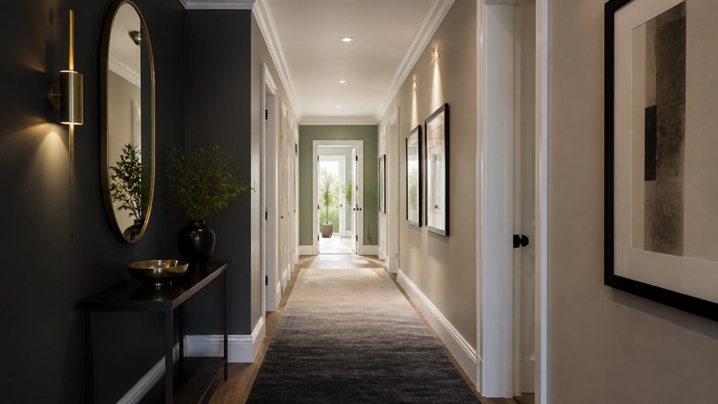
Before you pick a single paint swatch, map a colour-zoning plan that breaks your hallway into clearly defined functional zones—typically the entry/drop zone, the circulation corridor, and any shift points at doors, stairs, or sightline endpoints. Start by measuring wall runs, ceiling height, and door casing breaks, then sketch elevations so your zone boundaries land on architectural lines, not arbitrary mid-wall cuts.
Use Color psychology to assign intent: an anchoring, lower-value field at the drop zone to signal “arrive,” a calmer mid-value band through circulation to reduce visual compression, and a higher-contrast accent at endpoints to pull the eye forward.
Specify paint finish per zone: scrubbable satin where hands and bags hit, low-sheen eggshell for long runs, matte on ceilings to visually lift height.
Choose a Narrow-Hallway Colour Palette That Works
In a narrow hallway, you’ve got to balance high-LRV paint for bounce with a deeper anchor tone to prevent a flat, washed-out look.
Keep your zone-to-zone hues cohesive by shifting value and saturation within one colour family, so progression reads intentional and on-trend.
Lock in undertones under your actual lighting, then specify trim in a crisp or softened contrasting white (or colour-matched) to control edge definition and visual width.
Balance Light And Depth
How do you stop a narrow hallway from reading like a tunnel without washing it out? You balance reflectance and contrast.
Start by checking LRV: keep walls mid-to-high LRV to bounce light, then add depth with a lower-LRV ceiling band or a darker lower dado to ground the corridor.
Use satin or eggshell for controlled specular reflectance; matte can swallow illumination in tight runs.
Position lighting fixtures to graze surfaces, not blast them—wall washers and linear LEDs elongate evenly, while a single downlight creates hot spots and shadows.
Let flooring transitions do subtle optical work: run boards lengthwise for stretch, or switch to a calmer tone at pinch points to relieve visual compression.
Cohesive Zone-To-Zone Hues
Once you’ve dialled in reflectance and contrast, lock the hallway into the rest of the home with zone-to-zone hues that read intentional, not patched together. Pull one anchor colour from the adjacent room, then step it through the corridor in measured shifts: 10–20% lighter for the long run, slightly deeper at pinch points, and a crisp accent at the terminus for visual punctuation.
Use Complementary colour schemes with restraint: keep the dominant field colour stable, and deploy its complement as a controlled secondary on art niches, door reveals, or a slim datum line. That keeps colour zoning modern, not theme-y.
For Texture enhancement, pair higher-sheen paint on high-touch surfaces with lower-sheen walls to amplify depth without adding extra colour noise. Maintain saturation discipline throughout.
Undertones And Trim Choices
Because narrow hallways exaggerate colour cast, you’ll want to lock in undertones first, then specify trim so the palette reads clean under mixed daylight and warm LEDs. Start by sampling large swatches at both ends; if the wall reads green at one end and pink at the other, your base is too complex.
Prioritise undertone matching: pair cool greiges with crisp blue-white trims, or warm taupes with softened ivory, not stark white.
Next, decide whether trim should disappear or frame zones. For seamless flow, paint skirting, architraves, and doors in the same family, one to two sheen levels higher.
For intentional trim accentuation, shift to a contrasting LRV and a higher-gloss finish to sharpen geometry and modernise the corridor.
Mark Where Each Colour Zone Will Break
Start by spotting natural breakpoints—door casings, corners, ceiling drops, or a shift in flooring—so each colour block reads intentional, not arbitrary.
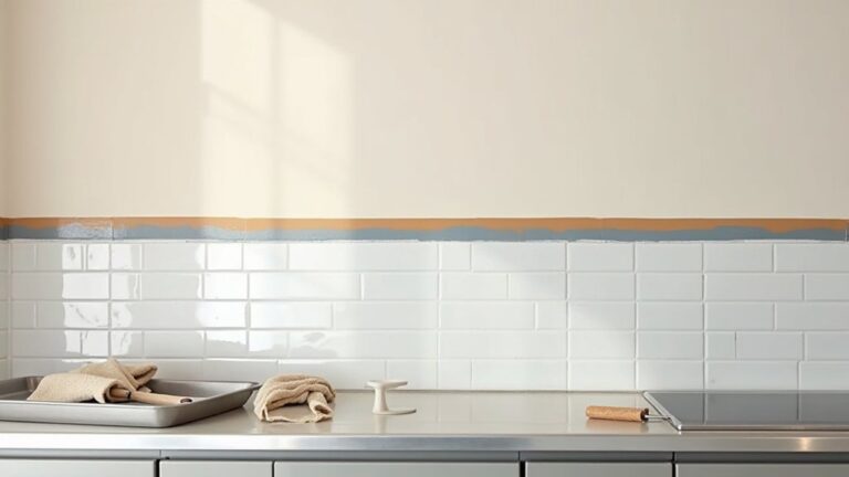
Then measure your run, snap a chalk line or laser level guide, and tape clean boundaries to lock in crisp progressions.
You’ll get the most contemporary, architectural look when you align every break with existing features like trim reveals, radiators, and lighting positions.
Identify Natural Breakpoints
Where should one colour zone end and the next begin? You’ll get the cleanest result when you align breaks with existing architectural cues, not arbitrary distances. Start by reading the corridor’s rhythm: door casings, ceiling drops, and sightlines create natural pauses that support hallway symmetry.
Use Color psychology to assign intent—energising tones near entry, calmer hues near bedrooms—then let the building dictate *segues*. Aim for balanced proportions so each block feels deliberate, not chopped up, and keep breaks consistent across both walls to avoid visual torque.
- A doorway portal that frames a saturated “welcome” band
- A radiator niche that “holds” a deeper mid-tone
- A ceiling beam shadow that signals a shift
- A picture-rail line that anchors a new palette
- A flooring threshold where texture changes underfoot
Measure And Mark Lines
Once you’ve locked in the breakpoints, translate them into crisp layout lines by measuring from fixed references—corner returns, door jambs, or a ceiling datum—so both walls track perfectly. Use a steel tape, not a cloth measure, and note dimensions in a quick elevation sketch to prevent cumulative error.
Snap a chalk line or project a laser line at each zone edge, then pencil it lightly so it won’t ghost through paint. For razor separation, apply low-tack washi or painter’s tape to the marked line and burnish the edge with a putty knife.
If you’re planning decorative wall patterns, grid them off the same baseline so repeats land cleanly. Double-check that your breaks read intentional against flooring transitions, then lock the lines before cutting in.
Align With Features
With your zone lines snapped and taped, shift focus to how those breaks land against real architectural cues so the scheme looks designed, not arbitrary. Anchor each junction to an existing datum—door casings, ceiling steps, radiator edges—so the eye reads intention.
Use colour psychology to place warmer hues at welcoming thresholds and cooler tones where you want visual recession. Specify paint finish per zone: matte for wall planes to reduce glare, eggshell on high-touch sections for durability, and satin on trim to sharpen the boundary.
Keep breaks square and plumb; a laser level beats guesswork.
- A crisp line kissing the architrave’s outside edge
- A split aligned to a ceiling rose’s centreline
- A darker block stopping at the radiator valve
- A tonal shift matching a picture rail height
- A bright band ending exactly at the last door hinge
Use Colour-Zoning Lines to Visually Widen the Hallway
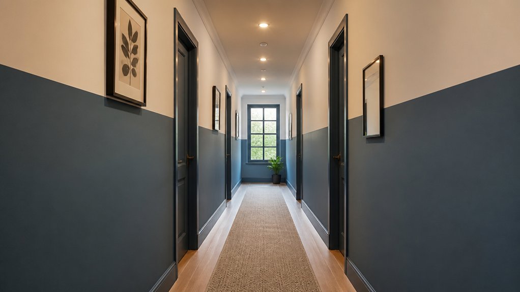
Although narrow hallways can feel like visual tunnels, you can widen them perceptually by running crisp colour-zoning lines horizontally across the long walls to break up linear “runway” perspective. Set a datum line at handle height or one-third wall height, then carry it continuously to create a strong sightline that reads as width, not length.
Use Color contrast strategically: pair a deeper lower band with a lighter upper field to lift the ceiling plane and reduce corridor glare. Keep edge geometry razor-sharp with low-tack masking and a matte finish to minimise specular streaking.
For visual balance, mirror the line on both walls and terminate it cleanly at door casings so the rhythm feels intentional, not accidental. Use coherent undertones to stay current.
Add Storage Features That Fit Each Zone
Where does all the everyday clutter go once you’ve established distinct colour zones? You assign storage to each band so the hallway reads intentional, not chaotic. Match joinery finish and hardware to the zone’s palette, and keep depth shallow (250–300mm) to protect circulation clearance.
Use Decorative storage where you want visual rhythm; deploy concealed compartments where you need clean sightlines.
- A slim shoe drawer stack aligned to the entry colour block
- A floating console with lift-up lid for keys and post
- A bench with under-seat concealed compartments for bags
- Vertical coat panels with integrated hooks and micro-shelves
- A recessed niche with baskets that echo the accent hue
Zone-based storage reduces visual noise and reinforces your colour geometry.
Layer Lighting to Support Each Colour Zone
Once you’ve zoned storage so the hallway stays visually quiet, use layered lighting to lock each colour band into place and control how the palette reads at different times of day. Start with ambient light: a slimline ceiling track or recessed downlights spaced evenly to avoid scalloping on long walls.
Add task light where you actually pause—at hooks, a console, or bench—using wall washers or low-glare sconces with diffusers. Then dial in Layer lighting for drama: aim adjustable spots across the accent wall to deepen saturation and sharpen the boundary between zones.
Specify 2700–3000K LEDs, CRI 90+, and dimmers so you can shift from crisp morning clarity to warm evening depth. Use separate circuits per zone.
Hang Art and Mirrors Within Each Zone
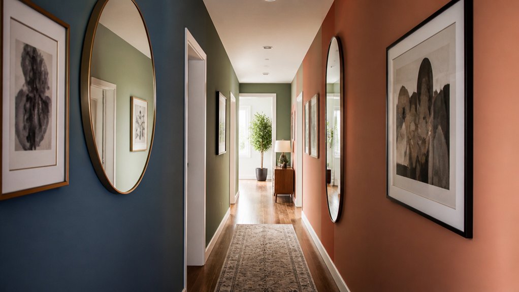
To keep colour zoning looking intentional rather than painted-on, you need to anchor each band with correctly scaled art and mirrors that sit fully inside its boundaries. Treat each colour block like a mini gallery wall: align frames to a shared datum line, keep consistent margins, and match finish temperatures to your paint undertone.
Use gallery lighting to model texture and sharpen edges, so the zone reads as curated, not accidental. Plan mirror placement to bounce light back through the corridor and visually widen pinch points, while staying true to the zone’s geometry.
- A slim black frame grid floating in the sage band
- A round mirror centred on the terracotta block, catching sconces
- Matte brass picture lights grazing canvas weave
- A linear rail system, evenly spaced, for swap-and-refresh flexibility
- A tall, narrow mirror echoing the hallway’s proportions and doors
Avoid These Hallway Colour-Zoning Mistakes
Although colour zoning can fix awkward proportions and guide movement, a few predictable missteps will make your hallway look chopped-up instead of architecturally composed. Don’t place zone breaks at random points; align them with architectural cues like door casings, cornice lines, or a change in flooring.
Avoid high-contrast stripes on both walls; you’ll amplify the corridor effect—use one dominant field colour and a controlled secondary band. Keep sheen consistent across zones; mixing dead-matte with high-gloss reads like a patch job, especially with Faux finishes.
Limit Pattern accents to one surface or axis, and match their scale to the hallway width. Finally, don’t ignore sightlines: test zones from the entry and at each threshold before committing.
Conclusion
You don’t fix a long, narrow hallway with paint alone—you engineer it with colour zoning. Lock zones to architectural cues (door casings, ceiling drops), run crisp break lines to control perspective, and balance high-LRV tones with deeper anchors for rhythm. In one recent project, you might set a warm off-white entry zone, a charcoal midpoint with a mirror and sconce layering, then a soft greige run-out—instantly wider-looking, cohesive, and on-trend.
About the Author