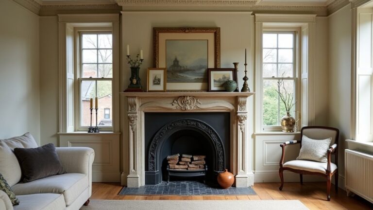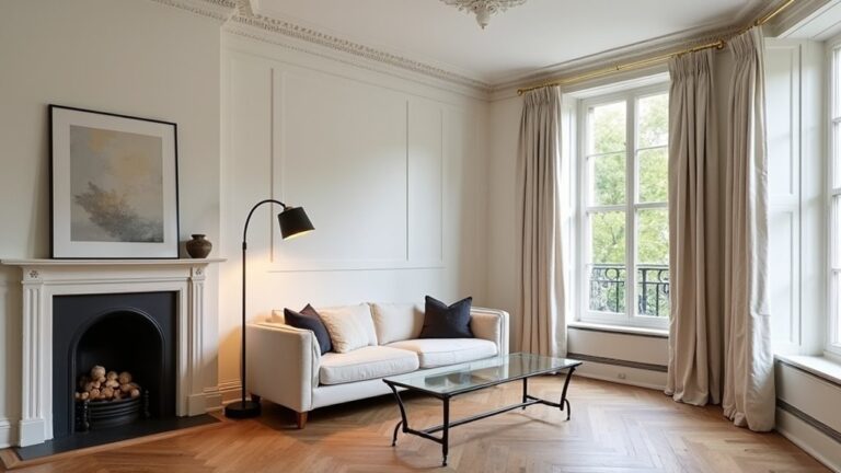
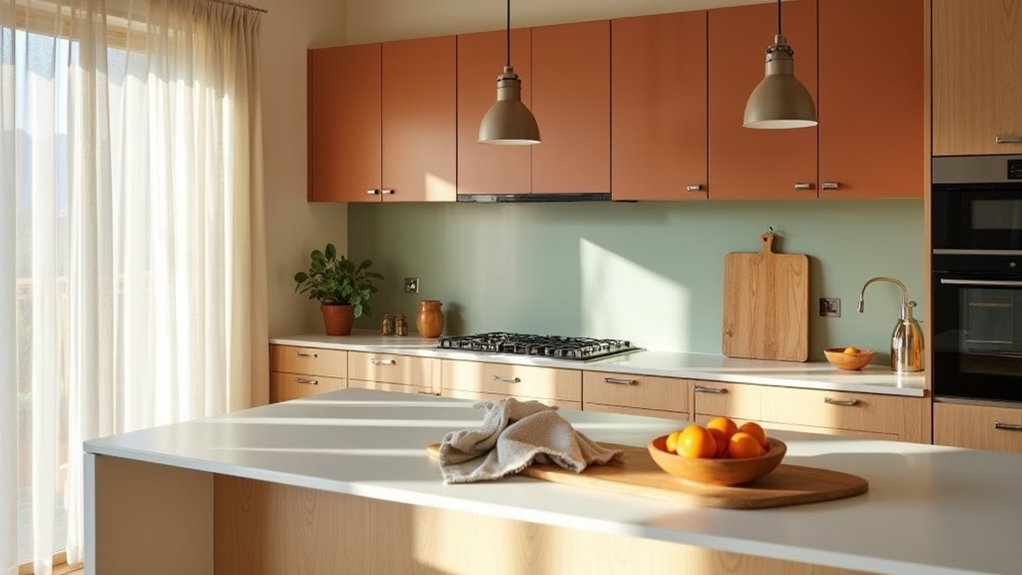
If you want a family kitchen that feels warm the moment you walk in, you start by choosing the mood, not the paint. You’ll lean into appetite-friendly hues like honey yellow or paprika red, then anchor them with warm taupe or soft putty so the space stays calm. You’ll test swatches morning to night to catch sneaky undertones, and you’ll finish with brushed brass or similar warm metals—but the real difference comes from where each colour goes.
Key Takeaways
- We chose three mood words—cozy, calm, upbeat—to guide colour, finishes, and the kitchen’s overall energy.
- We used warm, appetite-friendly accents like terracotta and honey yellow, balanced with matte neutrals to avoid overwhelm.
- We layered calming neutrals (creamy off-white, greige, warm taupe) on large surfaces to keep the space bright and grounded.
- We tested paint and material samples in morning sun and evening LEDs to confirm undertones stayed warm and consistent.
- We matched metals and sheen to undertones, limiting to two finishes and repeating them across hardware, lighting, and faucets.
Choose the Mood for Your Family Kitchen
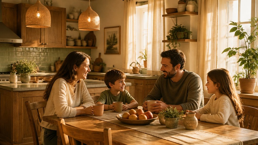
Before you pick paint chips or cabinet finishes, decide how you want your kitchen to *feel* during real family moments—busy breakfasts, homework at the island, and late-night chats.
Write three mood words (calm, upbeat, cozy) and rank them, because every finish choice should reinforce that target.
Use Color symbolism deliberately: you’ll read “clean” as crisp light tones, “grounded” as deeper, earthier notes, and “social” as lively accents.
Track Emotional impact in practice by testing samples under morning sun and evening LEDs, then noticing how your energy shifts.
Balance trend-aware choices like matte cabinetry and low-sheen walls with durable, wipeable finishes.
Finally, tie the mood together with consistent undertones across counters, backsplash, and flooring.
Pick Warm, Appetite-Friendly Kitchen Colours
Once you’ve nailed the mood you want your family kitchen to hold, choose warm, appetite-friendly colours that support it without turning the room orange or muddy.
Start with modern food-forward hues: terracotta, cinnamon, paprika red, honey yellow, and peachy coral in moderated doses. They lift energy and make meals feel more inviting.
Test swatches under morning and evening lighting, then pick one “hero” colour for high-impact areas like the island base, pantry door, or open shelving backboard.
If you love Bold accent walls, keep them contained and balance them with matte finishes to avoid glare.
For Bright colour palettes, mix one warm saturated colour with one softer warm partner, then repeat it in textiles, stools, or small appliances for cohesion.
Add Calming Neutral Kitchen Colours (and Where)
Although warm accents bring the appetite appeal, you’ll keep a family kitchen feeling grounded by layering in calming neutrals—think creamy off-white, greige, warm taupe, mushroom, and soft putty—then placing them where they do the most work: use them on walls and upper cabinets to bounce light, on large surfaces like backsplash tile to quiet visual noise, and on countertops (quartz, light-veined stone, or matte laminate) to create an easy, wipe-friendly backdrop that lets your “hero” colour read as intentional rather than loud.
Add the same neutrals to lower cabinets if your layout feels busy, or to open shelving to make everyday dishes look curated. Keep flooring medium-neutral to hide crumbs.
Finish with Decorative accessories in one neutral family—linen runners, matte ceramics, woven baskets—for clean Colour accentuation without clutter.
Test Undertones and Lighting so Colours Stay Cosy
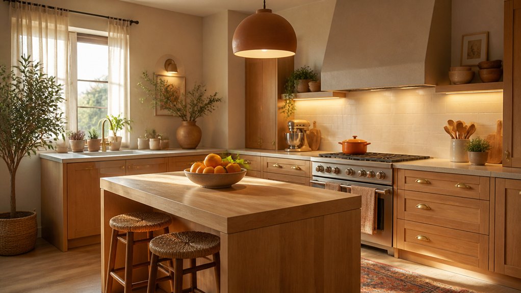
Calming neutrals do the heavy lifting in a family kitchen, but they only feel cosy if their undertones behave in your actual light. Before you commit, paint big swatches on two walls and move through the day. North light can pull greys blue, while warm afternoon sun can spike Color saturation and make beige read peach.
- A creamy off-white that stays soft at dawn, not sour under LEDs
- A greige sample that looks balanced beside your backsplash, not green at noon
- A muted clay accent that feels grounded, not loud when the cooktop lights click on
Match your lighting temperature to the mood you want: 2700K–3000K keeps families relaxed, while cooler bulbs can flatten warmth. Test under pendants and task lights, too.
Match Finishes and Hardware to Your Kitchen Colours
Because finishes read like “extra colours” in the room, you’ll get a more cohesive kitchen when you choose hardware and metals that echo your paint’s undertone. If your cabinets skew warm (creamy whites, clay, olive), pick brushed brass, champagne bronze, or aged copper; they amplify comfort.
If your palette leans cool (blue-greys, crisp whites), choose polished nickel, chrome, or stainless for a cleaner, brighter feel. Keep sheen consistent: pair matte paint with satin pulls, or glossy doors with brighter metal.
Repeat the finish in faucets, pendant trims, and decorative accents like frames or stool legs. For storage solutions, match bin labels, rail systems, and pantry baskets to your metal so open shelving still feels intentional.
Limit yourself to two metals max.
Conclusion
When you use colour psychology intentionally, you turn your kitchen into a space that feels good all day. Warm hues like honey yellow and paprika red keep energy up and make meals feel inviting, while taupe and putty calm things down where you linger. You’ll want to test swatches in morning and evening light so undertones don’t flip. Here’s the payoff: people spend about 37 minutes a day in the kitchen—make every minute feel cosy.
About the Author