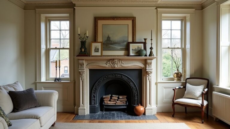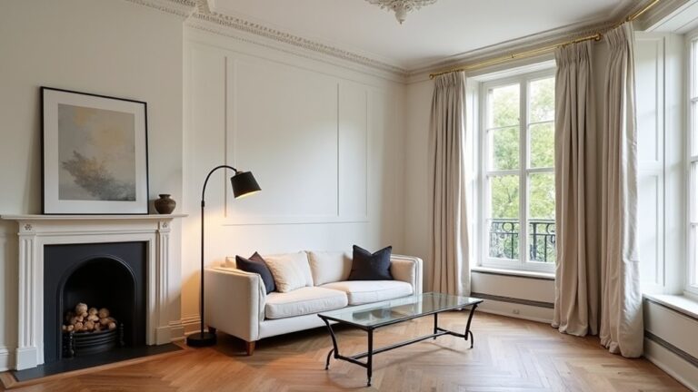
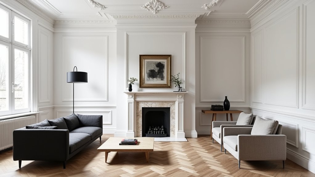
You probably don’t know that most “modern” clashes with Victorian mouldings come down to mismatched shadow lines, not colour. Start by letting the existing cornice, dado, and architrave dictate proportions, contrast, and where you place new elements. You’ll get a cleaner result if you choose a restrained UK palette and finishes that sit quietly beside the detailing, rather than compete with it. The key decision comes next, and it changes everything…
Key Takeaways
- Preserve original mouldings and use their profiles as references for new joinery, plaster repairs, and junction details.
- Position modern lighting to suit ceiling roses and cornice lines, avoiding downlights that cut across ornate runs.
- Use restrained wall colours to modernise, keeping mouldings crisp white or colour-drenched to control how much detail stands out.
- Coordinate contemporary finishes—hardware, metals, stone, and timber—by matching undertones, sheen, and visual weight with existing period elements.
- Choose clean-lined, well-proportioned furniture and limit statement pieces so Victorian details remain the room’s focal point.
Let Victorian Mouldings Set the “Rules
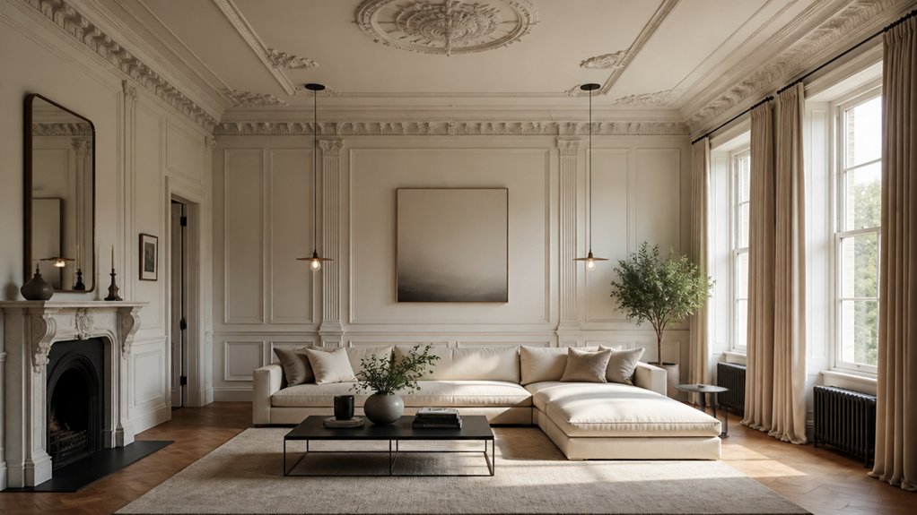
If you’ve still got original Victorian cornices, ceiling roses, picture rails, or architraves, let them set the rules for every contemporary choice you make. Survey profiles, depths, and junctions, then treat them as fixed dimensions: you’ll align new lighting positions to ceiling roses, keep pendants centred, and stop downlights from peppering ornamental runs.
Match joinery proportions to existing architraves, and repeat their shadow lines in new skirtings, door casings, and built-ins. When you repair, you’ll specify lime plaster where appropriate and take moulds from intact sections, preserving Victorian craftsmanship.
Choose hardware and glazing with similar visual weight, so nothing looks mean against bold cornicing. You’re not copying the past; you’re protecting historical authenticity while introducing cleaner forms around it.
Choose Modern Colours That Highlight Mouldings
Although Victorian mouldings carry plenty of visual muscle on their own, the right modern colour scheme makes their profiles read sharper, cleaner, and more deliberate. Start with disciplined Color coordination: pick a restrained base tone, then vary depth rather than hue so cornices and picture rails stay legible in changing UK daylight.
- Use cool off-whites, soft greiges, or mineral greens to modernise without flattening relief.
- Build contrast with a single Accent wall in a deeper shade, placed behind a chimney breast or at the end of a Victorian hallway.
- Match undertones to existing elements: warm paints with honeyed floorboards; cooler paints with slate, terrazzo, or stainless fittings.
Test swatches at skirting height and at cornice level, morning and evening, because north-facing rooms read noticeably colder.
Decide: Painted Mouldings or Crisp White?
Where should your eye land first: on the moulding itself, or on the room around it? If you want the cornice, ceiling rose, or architrave to read as architecture, keep it crisp white. Use a durable water-based satinwood on timber and a matt emulsion on plaster; it’s the cleanest way to sharpen profiles under typical UK light.
If you’d rather the detail recede, paint mouldings the same shade as the wall. This “colour drench” calms busy rooms and lets Accent walls take the lead.
Go one step further with Faux finishes: a soft limewash effect can make repaired plaster blend, while a subtle stone tone suits Victorian proportions.
Whatever you choose, test samples at skirting height and at cornice level; shadows change the outcome.
Balance Modern Furniture With Victorian Mouldings
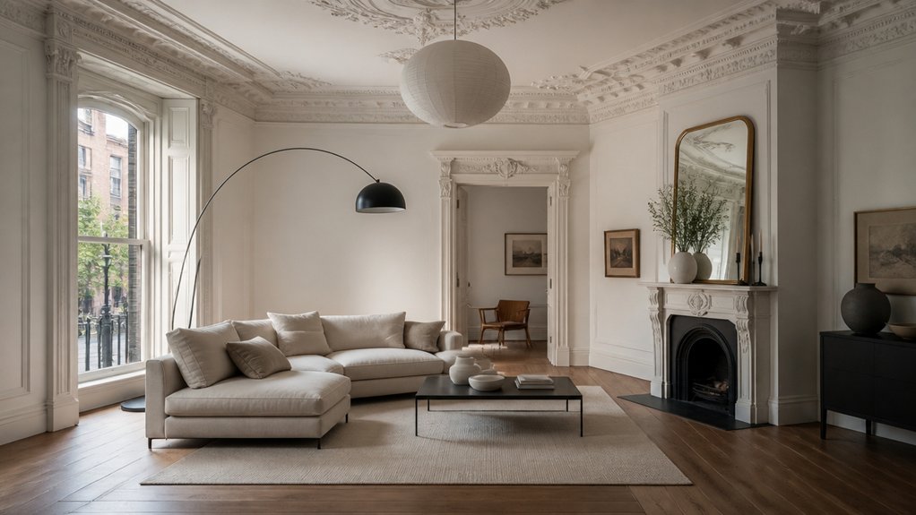
Once you’ve settled whether the mouldings stand out in crisp white or sit back in a colour-drenched scheme, the next job is stopping your furniture from fighting the architecture. Let the cornice and ceiling rose set the rhythm, then choose pieces with clean lines and disciplined proportions to deliver Modern simplicity without erasing Victorian elegance.
In UK terraces, favour lower-backed seating so sightlines to dado rails and panelled reveals stay clear, and keep circulation generous around bay windows and fireplaces.
- Choose a sofa with square arms and a tight back, scaled to sit below the picture rail.
- Use a slim-legged dining table to echo the room’s verticality, not block it.
- Limit statement pieces to one per zone, so the mouldings remain the hero.
Mix Metals, Wood, and Stone Without Visual Clutter
Because Victorian mouldings already give you a strong visual framework, you need your finishes—metals, timber, and stone—to read as a tight, repeatable palette rather than a grab-bag of “nice” materials.
Pick one dominant metal (brushed brass or blackened steel), then echo it in 3–5 touchpoints: handles, tapware, frames, and a single statement tray.
Keep timber in one temperature—warm oak or cooler walnut—and repeat the same sheen (matt, not glossy) across furniture and shelving.
Use stone as the calm: honed marble, limestone, or composite in a consistent undertone.
Create texture contrast by pairing smooth stone with open-grain wood and a restrained metal profile.
Limit accent accessories to one material per surface, and group them.
Pick Lighting That Complements Victorian Detailing
Although ornate cornices and ceiling roses already command attention, you’ll get the best results by treating lighting as a layer that traces those lines rather than competing with them. Choose fittings that respect period proportions: a pendant should sit centrally beneath the rose, and wall lights should land on solid plaster, not over fine moulded runs.
In UK terraces, aim for warm LEDs (2700K) to flatter aged paint and lime plaster, and use dimmers to soften evening glare.
- Specify Vintage fixtures with slimmer stems and opal shades to echo Victorian glasswork
- Use Elegant chandeliers with restrained drops so they frame, not hide, the rose
- Add picture lights or uplighters to wash cornices and reveal shadow detail
Keep finishes consistent with nearby ironmongery for calm cohesion throughout.
Avoid the Mistakes That Make Rooms Feel Mismatched
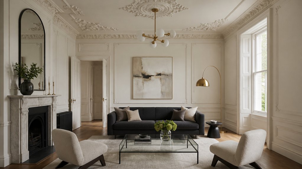
You’ll keep a Victorian room cohesive when you respect the scale of its cornices, ceiling roses, and architraves—so don’t swamp them with chunky contemporary joinery or miniaturised trim.
You should limit competing styles by choosing one modern thread (clean-lined furniture, restrained hardware, or minimal glazing) and letting the original mouldings lead.
You’ll unify the look by repeating a tight palette and consistent materials across paint, metals, and textiles, rather than mixing finishes room by room.
Respect Moulding Scale
When you’re working with original Victorian cornices, ceiling roses, and skirting boards, scale is the non-negotiable detail that keeps contemporary pieces from looking undersized or shouty. You need scale harmony and proportion balance so the room reads intentional, not lopsided.
Start by measuring key mouldings in millimetres: cornice projection, rose diameter, skirting height. Then choose modern elements that echo those dimensions rather than fight them.
- Match pendant diameter to the ceiling rose (or deliberately exceed it by 10–20%).
- Keep sofa backs and headboards below the dado line, and align artwork centres to it.
- Use bulkier curtain poles, taller radiators, or deeper shelves in rooms with 200mm+ skirting.
In typical UK terraces, these checks stop sleek pieces feeling flimsy against robust plasterwork.
Limit Competing Styles
Because Victorian mouldings already bring a strong architectural “voice,” the quickest way to make a room feel mismatched is to layer too many competing styles on top—think Scandi minimalism, mid-century curves, and industrial black metal all fighting the same cornice line. Pick one contemporary direction and let the joinery do the heritage work.
If you want modern, favour clean-lined furniture with restrained profiles, and keep statement pieces to one or two. If you prefer a heritage-leaning scheme, choose updated classics rather than novelty trends.
In UK period homes, aim for Historical accuracy in the envelope and modernity in movable items; don’t rewrite the plasterwork’s intent. Audit the room: if three different design “languages” appear, remove one. That’s style consistency in practice.
Unify Color And Materials
Even if you keep the furniture contemporary, the room won’t read as coherent unless the colour palette and material choices deliberately echo the Victorian mouldings. Start by sampling tones already present: aged plaster, timber floors, and any original marble or slate.
Then lock in Color harmony by repeating those hues across walls, textiles, and metalwork, rather than introducing random trend colours.
- Paint ceilings and cornices in a softer tint of the wall colour to keep the mouldings crisp, not shouty.
- Use Material coordination: pair modern matt black or brushed brass with existing door furniture, not polished chrome.
- Balance old and new timber—oak, walnut, or painted joinery—so skirting boards and shelving don’t clash.
This approach prevents that “showroom plus period shell” mismatch common in UK renovations.
Conclusion
Blending contemporary decor with original Victorian mouldings works when you let the period detailing lead and you edit everything else. Choose modern, muted UK-friendly colours that sharpen the profiles, then decide whether you’ll paint mouldings for cohesion or keep them crisp white for contrast. Balance clean-lined furniture with correct scale, and mix metals, timber, and stone with restraint. Pick lighting that respects shadow lines. Remember: less is more, and it’ll feel timeless.
About the Author