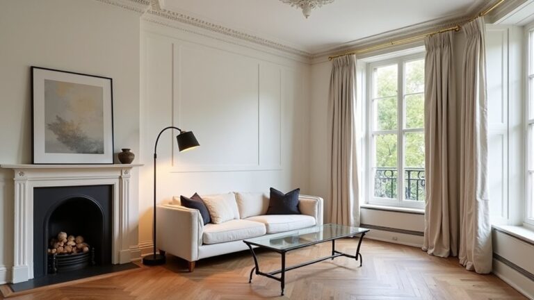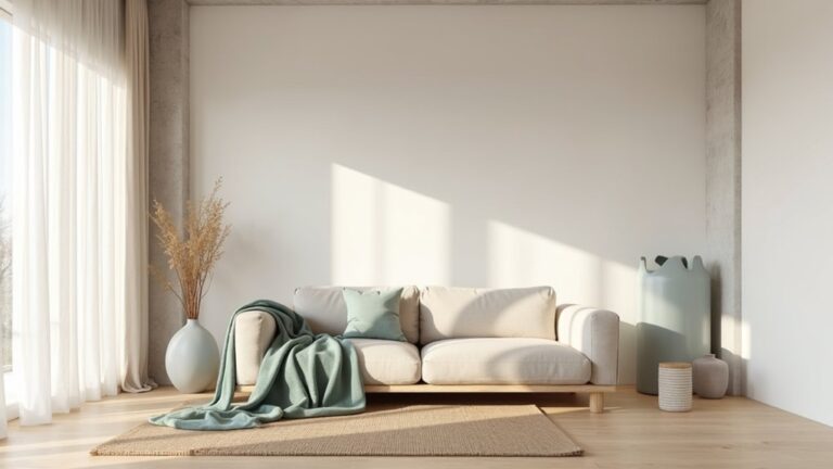
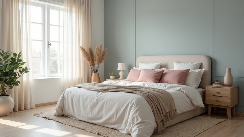
Coincidentally, you’ll get a calmer bedroom faster when you treat colour like a low-stimulation system, not a trend. You start with warm greiges and creamy whites, then match undertones across walls, bedding, and wood so nothing “buzzes” at night. You keep saturation low, layer linen and wool for visual softness, and use a few darker accents to anchor the room. The key move most people miss is…
Key Takeaways
- We used a 60/30/10 low-saturation palette to reduce visual noise and keep the room serene.
- We tested paint and fabric samples in daylight and lamplight to confirm undertones stayed stable.
- We chose muted, mid-to-high LRV wall colours and layered same-undertone bedding for calm, low-contrast harmony.
- We built depth with moderate contrast—creamy walls, oat linens, walnut or charcoal accents—balanced evenly around the room.
- We added small, repeated accent tones in cushions, throws, and decor, keeping hues tight and avoiding high-contrast prints.
Choose a Calming Bedroom Colour Palette (Fast Method)
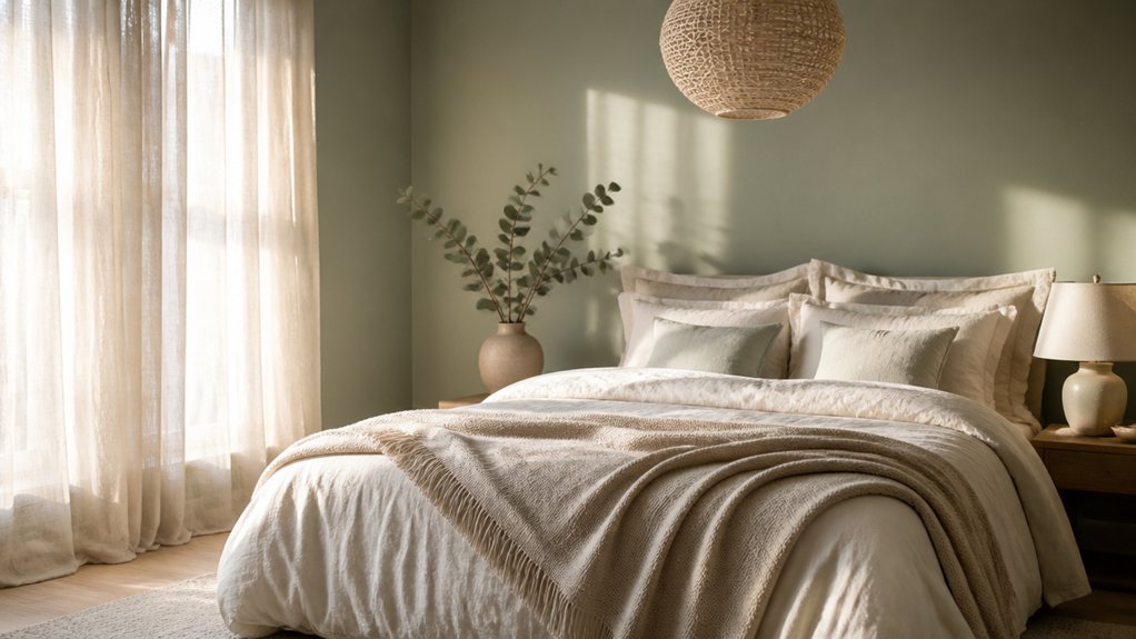
If you want a calm bedroom fast, start by locking in a tight 3-part colour palette: one soft base (about 60% of what you see), one supporting mid-tone (30%), and one muted accent (10%).
Use Color psychology to reduce visual noise: choose low-saturation, low-contrast colours that keep your brain in “downshift” mode.
Put the 60% on walls and large textiles, the 30% on bedding layers or a rug, and the 10% on one repeatable detail (piping, a throw, frames).
This distribution mirrors how top-performing paint brands stage rooms for broad appeal and fewer returns.
Then validate it under both daylight and lamps to protect your sleep environment from surprise glare or harsh contrast.
Pick the Best Undertones for Sleep (Warm vs Cool)
Although “warm vs. cool” sounds like a simple preference call, undertones can change how restful a bedroom feels because your light sources amplify them differently at night. To protect sleep quality, you’ll want undertones that stay stable from daytime to lamplight and don’t turn sallow, icy, or muddy.
- Test paint chips under your exact bulbs (2700K–3000K reads warmer; 3500K+ reads cooler) to measure undertone influence.
- If you use warm bulbs, choose paints with subtle warm or neutral undertones; cool-leaning grays can go bluish and feel brisk.
- If you use cooler LEDs or strong daylight, pick neutral-to-cool undertones; warm creams can look yellowed.
- Match undertones to fixed finishes (wood, metals, flooring) so the room reads cohesive at night.
Use Low-Saturation Bedroom Colours to Reduce Stimulation
Because your visual system treats intense colour as “important,” high-saturation walls and textiles can keep the room feeling mentally active even when the lighting is low.
To dial down stimulation, you’ll get better results from low-saturation paints—think greyed, dusty, or softened versions of your chosen hue—so the eye doesn’t lock onto edges and hot spots.
Aim for mid-to-high light reflectance (LRV) without chroma: it keeps the space readable at night without feeling “lit up.”
If you love Vibrant contrasts, shift them to materials with matte finishes and low sheen, which reduces glare and perceived intensity.
For bold accents, cap them at small, movable pieces (a cushion, artwork) so you can remove them when sleep needs priority.
Layer Warm Bedroom Neutrals for a Grounded Base
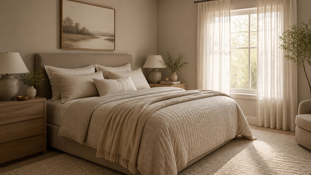
You’ll get a steadier, more calming backdrop when you pick warm undertones—think ivory, greige, and sand—since they read softer under evening lamps than cool whites.
You can keep the palette neutral without looking flat by mixing textures like matte paint, woven linen, and brushed wood to add measurable contrast without adding color.
Balance light and depth by pairing pale walls and bedding with a few mid-tone accents (a camel throw or walnut nightstand) so the room feels anchored, not washed out.
Choose Warm Undertones
When you build your palette on warm undertones, the whole room reads calmer and more cohesive, even in low evening light. You’ll avoid that “cold gray” cast that disrupts rest and makes skin tones look flat.
Warm beiges, creamy off-whites, and muted clay tints support softness without feeling dated, which keeps resale appeal strong while still feeling personal.
Use these checks before you commit:
- Test large swatches at dawn, midday, and lamp-lit night.
- Match undertones to fixed elements (flooring, wood, stone) first.
- Favor low-VOC options when selecting eco-friendly paints for better air quality.
- Reserve the warmest shade for creating cozy nooks so they feel inviting, not dim.
Mix Neutral Textures
Warm undertones set the color temperature; textured neutrals give that warmth depth and staying power. You’ll get a calmer bedroom when your eye reads subtle change without high-chroma stimulation, so build interest through textural contrast instead of more color.
Start with a warm greige or creamy wall, then layer a nubby linen duvet, matte cotton sheets, and a wool or boucle throw. Add a low-sheen oak nightstand or woven rattan, plus a stoneware lamp base to introduce grounded tactility.
This material variety creates visual rhythm that feels intentional and premium—exactly what buyers associate with “hotel calm.” Keep undertones aligned (warm whites, sand, oat) and repeat one texture twice so the scheme looks curated, not cluttered.
Balance Light And Depth
Although a soft palette reads serene, the room won’t feel truly calming—or photo-ready—unless you balance light values with a few deeper anchors. Research on visual comfort shows moderate contrast helps the eye “land,” so you’ll want warm neutrals in layers: creamy walls, oat linens, then walnut, umber, or charcoal accents to prevent washout under bedroom lighting.
Treat depth like an ROI move: it photographs richer and feels more premium without costly renovations. Use furniture placement to distribute darker notes evenly, not in one heavy corner.
- Ground the bed with a mid-tone headboard or framed art.
- Add one low, dark piece (bench or nightstand).
- Repeat depth in textiles: throw, rug border, piping.
- Tune bedroom lighting: 2700K bulbs, dimmers, shaded lamps.
Add Muted Accent Colours (And Where to Use Them)
Because a single muted accent can guide your eye without raising your stress level, use low-saturation colours to add depth in a calm bedroom rather than chasing high-contrast “pop” shades. Muted accent colours work best when you repeat them in small, intentional doses to support visual rhythm and perceived order.
Start with colour placement: put your accent where your gaze naturally lands—behind the headboard, on bedside lampshades, or on a single lumbar cushion. Choose dusty clay, foggy blue, or softened olive, then echo it once more in art mats, a throw, or ceramic hardware.
Keep finishes matte or textured so light scatters gently. If you’re buying new pieces, pick one “anchor” item first, then match undertones to your wall colour for cohesion.
Keep Bedroom Contrast Low for Visual Comfort
When you keep contrast low, your bedroom reads as visually “quiet,” which design research links to reduced cognitive load and easier relaxation. You support visual stability by choosing colours with similar lightness values, so your eyes don’t keep “jumping” between extremes—especially if you have higher contrast sensitivity at night.
Aim for gentle tonal shifts instead of stark black-and-white pairings, and keep hard edges to a minimum.
- Choose mid-tone walls and ceiling whites that sit close in value, not icy-bright.
- Use soft-matte finishes to reduce specular glare from lamps and daylight.
- Keep large surfaces (walls, floors, drapery) within one value band for smoother scanning.
- Reserve higher contrast for small functional cues only (switch plates, handles), not focal points.
Repeat Your Calming Colours Across Bedding and Decor
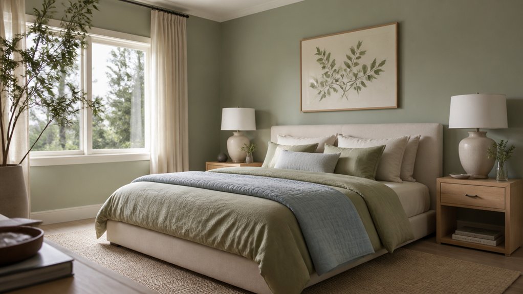
You’ll make a soft palette feel more restful when you repeat the same calming tones across textiles—think curtains, rugs, and throw pillows—so your eye reads one cohesive field instead of scattered color cues.
Layer your bedding in tight harmony (sheets, duvet, quilt, and throws within the same hue family and a few shades apart) to create depth without raising contrast.
Then repeat those hues in small accent decor—lamp shades, frames, ceramics—to reinforce consistency and keep the room’s visual “noise” low.
Echo Tones In Textiles
If your wall color sets the mood, your textiles keep it consistent. You’ll get a calmer room when you repeat the same undertone in touchpoints you see and feel daily. Studies on visual coherence show fewer competing cues reduce perceived clutter, so Textile echo tones matter more than bold pattern.
Aim for fabric harmony by matching undertones (warm vs cool) rather than exact dyes, since lots vary by mill and light.
- Pick one “anchor” tint from your paint chip (e.g., misty blue-gray).
- Echo it in pillowcases, a throw, or a bench cushion within one shade step.
- Use texture shifts (linen, brushed cotton, boucle) to add interest without new hues.
- Check samples in morning and lamplight before buying.
Layer Bedding Color Harmony
Because your bed fills the largest visual footprint in the room, repeating your calm wall undertone across layered bedding creates instant cohesion and measurably lowers “visual noise” (a known driver of perceived clutter).
Start with a duvet or quilt in a near-match: one to two shades lighter than the wall reads airy, not flat. Then build Layer bedding color harmony with mid-tone sheets and a slightly deeper throw, keeping all pieces within the same temperature (cool with cool, warm with warm).
Use low-contrast micro-patterns (pinstripes, small geometrics) only if they share the undertone; high-contrast prints spike attention and feel busy.
Finish with two pillow tiers in adjacent values so your eye moves smoothly, creating visual serenity without looking staged.
Accent Decor Color Repeats
Once your bedding sits in the same undertone family as the walls, carry that calm into the rest of the room by repeating those exact hues in small accents. Designers call this accent decor color repeats, and it reduces visual noise so your brain reads the space as settled.
Keep repeats tight: one to two tints and one deeper shade, then distribute them evenly to avoid “color hotspots” that feel restless.
- Echo your duvet’s main hue in a throw, then match its piping to cushion trim.
- Pull one wall tint into art mats or frames for visual cohesion in accessories.
- Choose bedside lampshades in the same undertone; swap bulbs to 2700K for softness.
- Repeat the deepest accent in a rug border or vase, not large furniture blocks.
Conclusion
When you design for sleep, you’re not just picking paint—you’re lowering visual “noise.” You’ll get the fastest calm by choosing warm greiges and creamy whites, keeping saturation low, and managing contrast with a few deeper accents. Then you’ll reinforce the palette through linen, wool, and rattan, repeating undertones across bedding and decor for cohesion. Think of it like a dimmer switch: each muted layer turns stimulation down, comfort up, night after night.
About the Author