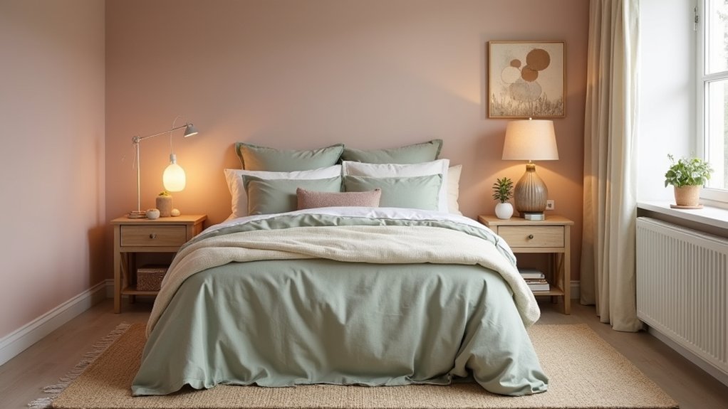
Nearly 60% of homeowners say paint colour is the hardest decorating choice, and bedrooms magnify that pressure. You can avoid guesswork by defining what “soft” means for your space, then matching it to measurable cues like low saturation and higher LRV. Next, you’ll check daylight direction, test swatches across the day under high‑CRI bulbs, and build a tight 3–5 tone palette with controlled undertones—because one small mismatch can shift the whole mood…
Key Takeaways
- Choose soft colours with low-to-mid saturation, higher LRV, and a consistent undertone to reduce visual noise and keep contrast gentle.
- Assess your room’s daylight direction and test large swatches on two walls, checking morning, afternoon, and evening shifts.
- Match colour families to mood: misty blue-greys or sage for calm, warm oatmeal or blush for cozy, off-white or seafoam for airy.
- Build a 3–5 tone palette: 60–70% wall anchor, 20–30% textiles, and 5–10% accents in two coordinated finishes.
- Use consistent 2700–3000K or 3500K high-CRI bulbs, layered lighting, and appropriate sheen (matte/eggshell/satin) to maintain softness.
Define What “Soft Bedroom Colours” Means for You
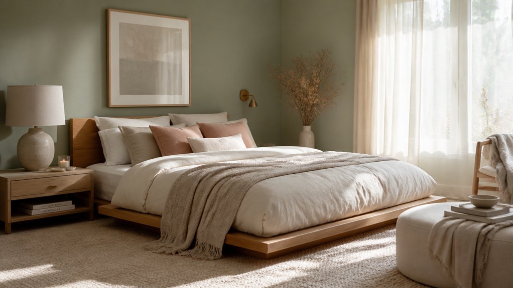
Although “soft bedroom colours” often gets used as a catch‑all, you’ll get better results if you define it by measurable cues: low-to-mid saturation, a lighter value (higher LRV), and an undertone that supports the mood you want—warm (peach, oatmeal, blush) for coziness, cool (misty blue, sage, pale grey) for calm, or neutral (greige, ivory) for flexibility.
Next, translate Color psychology into targets: choose hues that lower visual noise and keep contrast gentle between walls, trim, and textiles. Pull 3–5 swatches, then compare their LRV numbers so your palette stays consistently airy.
Decide whether you want “skin-friendly” warmth or spa-like coolness. Finally, select paint finish options that match your tolerance for sheen: matte hides wall flaws, eggshell balances wipeability, and satin reads crisper on trim.
Check Your Lighting for Soft Bedroom Colours
Where does your bedroom actually get its light—north, south, east, or west—and how does it shift from morning to night? That daylight profile determines whether soft paints read crisp, flat, or muddy. Before you commit, test swatches on two walls and view them at set times.
- Audit your bulbs: choose a consistent color temperature (2700–3000K for warm LEDs, 3500K if you need cleaner whites) and high CRI (90+), so undertones stay accurate.
- Tune lighting placement: layer ceiling ambient with bedside task lights and a low, indirect source to reduce harsh shadows and banding on matte finishes.
- Control glare: add dimmers, diffusers, and shades; check reflections off mirrors, glossy furniture, and screens, since they’ll skew perceived softness.
Choose Soft Bedroom Colours by Mood (Calm, Cozy, Airy)
Once you’ve mapped your daylight and dialed in consistent bulbs, you can pick a soft bedroom colour based on the mood you want the room to deliver: calm, cozy, or airy.
For calm, choose low-chroma blue-greys, misty sage, or muted lavender; these sit mid-to-cool on the spectrum and reduce visual “noise,” especially in matte finishes.
For cozy, go warm and desaturated—clay pink, soft terracotta, oatmeal, or caramel beige—so your walls reflect longer wavelengths and feel nearer at night.
For airy, lean light and slightly cool: powdery off-white, pale seafoam, or whisper grey to boost perceived volume and bounce light.
Use Artistic color blending by selecting a colour with a subtle undertone shift, and apply Cultural color symbolism thoughtfully before you commit.
Build a 3–5 Tone Soft Bedroom Colour Palette
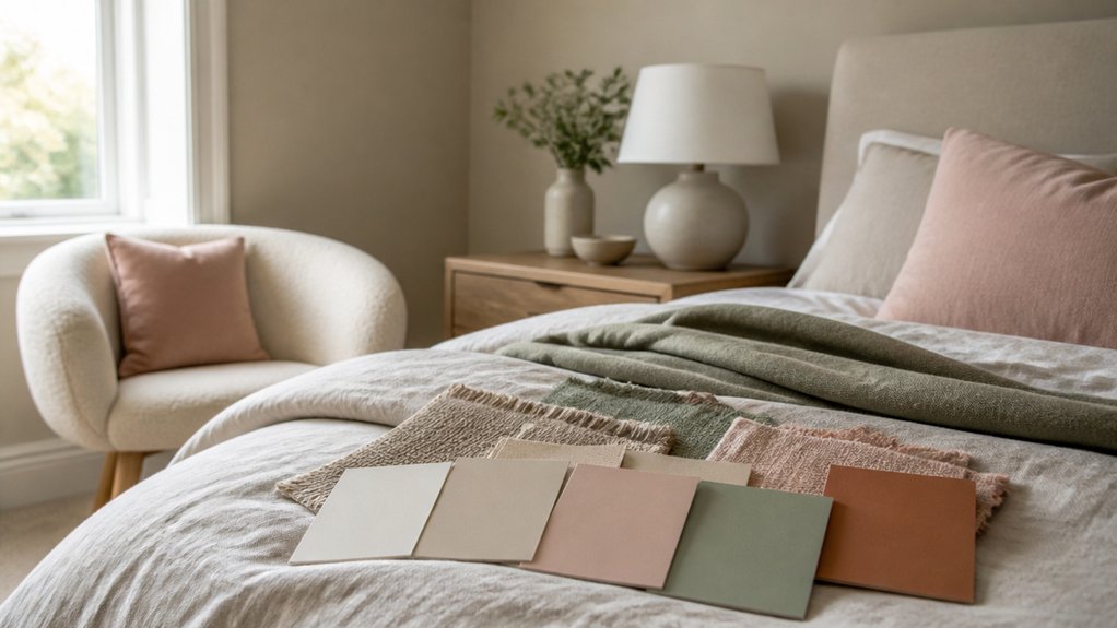
Because a single “perfect” paint colour can shift dramatically from day to night, you’ll get a more reliable result by building a tight 3–5 tone palette: one dominant soft wall colour, a secondary tone for large textiles (duvet, drapery, rug), and 1–3 accent tones for trim, wood, metals, and small decor.
This system keeps the room cohesive while still feeling layered and current.
- Pick your anchor (60–70%): choose a low-chroma wall colour; save Accent wall ideas for a 10–20% shift in the same family.
- Assign the textile block (20–30%): match duvet and rug to the secondary tone so the bed reads intentional.
- Lock accents (5–10%): use two finishes max and nail furniture color coordination by repeating wood/metal tones across nightstands, frames, and hardware.
Layer and Balance Undertones so Soft Colours Shine
Even if you’ve nailed a soft 3–5 tone palette, undertones can still fight each other and make the room look dull, sallow, or oddly “off.” Start by identifying each paint’s bias: warm (yellow/red), cool (blue/green), or neutral. Check swatches under your bedroom’s lighting at morning and night; LEDs often skew green or pink.
Then layer strategically: keep walls and large textiles in one undertone family, and use smaller pieces to add controlled contrast. For example, pair warm greige walls with muted clay cushions, then add a cool, desaturated slate throw to sharpen edges without jolting. Use blackened-brass hardware to bridge temperatures.
For Accent wall ideas, choose one shade deeper in the same undertone. If you want contrasting colour schemes, contrast value, not undertone.
Conclusion
You’ve defined what “soft” means for your bedroom, checked daylight and bulb CRI, and chosen a mood-led direction—calm, cozy, or airy. Now lock in a 3–5 tone palette: a dominant wall shade with low saturation and higher LRV, then textiles and one restrained accent. Keep undertones consistent, and use layered lighting to avoid colour shift. Remember: measure twice, paint once. Test swatches morning to night for true harmony.
About the Author