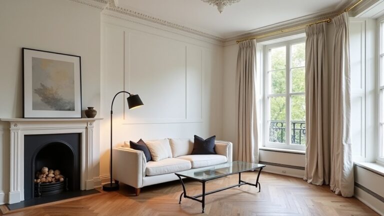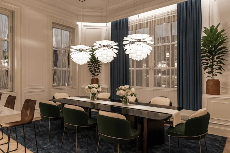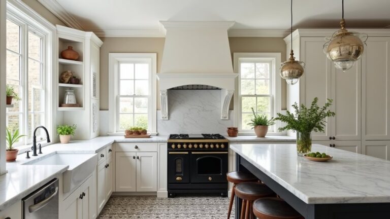
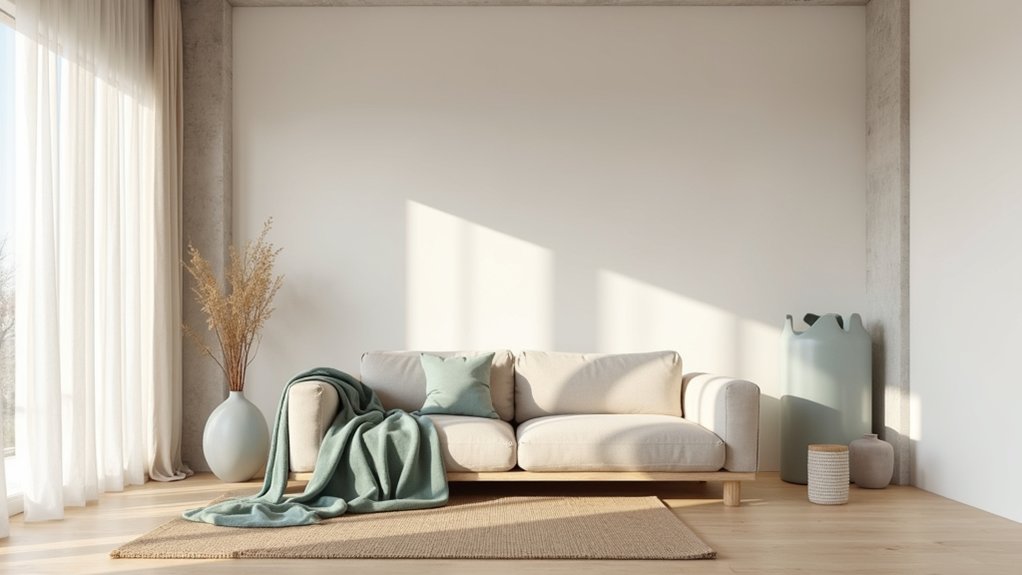
In a converted Brooklyn warehouse loft, you’ll often see warm white walls, greige concrete, and a single muted olive sofa because low-saturation colour lowers perceived visual noise and supports calm. You keep value high for light bounce, then use controlled contrast to frame one focal point. You balance warm neutrals with a soft cool undertone so the space doesn’t feel flat or chilly. Next, you’ll want to set zoning cues without breaking the minimalist flow…
Key Takeaways
- Use one warm neutral across major surfaces to reduce visual noise and create a continuous, calming field.
- Add a single dark anchor (charcoal or navy) on structural lines to sharpen architecture without increasing clutter.
- Keep saturation low and values close, reserving high contrast only for intentional focal points like art or window frames.
- Introduce one muted accent colour at 5–10% and repeat it twice for cohesion without overstimulating the space.
- Layer texture and sheen (matte paint, oiled wood, linen) to add depth, warmth, and calm without adding colour complexity.
Start With a Calm Minimalist Loft Palette (3 Steps)
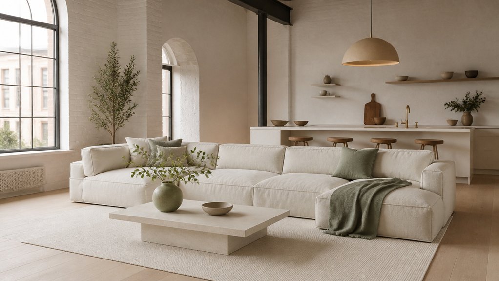
If you want your loft to feel calm without losing its edge, start by choosing a minimalist palette in three deliberate steps.
Step one: pick one dominant neutral with proven soothing associations—warm white, greige, or soft clay—and repeat it across large planes (walls, ceiling, key textiles) to lower visual noise.
Step two: choose a single grounded dark (charcoal, inky navy) for architectural anchors like steel columns or window frames; it sharpens lines without busying the room.
Step three: add one controlled accent for balancing bold accents—oxidized green, muted rust, or ochre—kept to 5–10% in art or a chair.
While you do this, prioritize incorporating natural light by sampling swatches at morning and dusk, since loft glazing shifts undertones.
Use Simple Colour Rules: Saturation, Value, Contrast
Once you’ve set your neutral base, dark anchors, and a restrained accent, the calm comes down to three measurable levers: saturation, value, and contrast.
Keep saturation low (muted, dusty, greyed) so the eye doesn’t “ping” between objects; studies on visual load show high chroma increases arousal.
Control value by clustering tones within a tight light-to-mid range, then letting anchors sit clearly darker; this creates legibility without visual noise.
Manage contrast like volume: reserve sharp edges for one or two focal lines (a black window frame, a single artwork mat) and soften everything else with close values.
You’ll amplify Colour symbolism—quiet, grounded, intentional—while reducing Emotional impact spikes from competing, high-contrast, high-chroma surfaces.
Choose Warm Minimalist Neutrals That Won’t Look Flat
Because lofts often flood with cool daylight and expose raw materials, warm minimalist neutrals keep the space calm without turning it stark. Choose undertones that counter steel and concrete: oat, sand, putty, camel, and warm greige.
Research on visual comfort shows mid-value, low-chroma palettes reduce arousal, so aim for soft contrast rather than bright whites.
Prevent flatness with Color layering: pair a matte wall paint with a slightly deeper plaster, then add linen, bouclé, or wool in adjacent values. Keep sheen varied—eggshell on trim, matte on walls, oiled wood on floors—so light reads as depth.
If you want a Bold accent, use one controlled note (rust leather, walnut, or terracotta) and repeat it twice for cohesion.
Add Soft Cool Hues to Calm an Open-Plan Loft
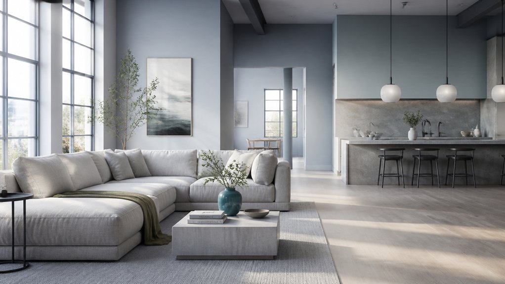
While warm neutrals set the baseline, soft cool hues can lower the “visual temperature” of an open-plan loft and make large sightlines feel quieter. Aim for desaturated, greyed tones—misty blue, sage, dusty lilac—because research links lower Color temperature palettes with reduced arousal and steadier attention, improving perceived calm.
Keep chroma low so the hue reads like atmosphere, not decoration, and test it across daylight shifts: north light sharpens blues, while late sun warms them. Use large, matte surfaces (walls, ceiling planes, built-ins) to create a continuous field that visually recedes, expanding breathing room without adding visual noise.
To manage emotional impact, pick one cool family and repeat it at varied values, from near-white to midtone.
Use Warm Accents, Texture, and Zoning to Stay Cohesive
Even if you’ve cooled the envelope with misty blues or sages, you’ll keep the loft from feeling flat by layering controlled warm accents, tactile materials, and clear zones that guide the eye. Warmth signals comfort; studies link warmer wavelengths to perceived coziness, so use it sparingly for contrast.
Choose Accent color pairings like clay with slate, brass with dove grey, or cognac leather against blue-grey walls. Limit accents to 10–15% of the visual field—pillows, art, a runner, or a single statement chair—to avoid visual noise.
Build calm through Texture layering: matte limewash, boucle upholstery, oak grain, and ribbed linen diffuse light and reduce harsh industrial echo. Then zone with rugs, pendant pools, and consistent trim color, so dining, lounging, and working feel distinct yet unified.
Conclusion
Keep your loft calm by sticking to low-saturation neutrals, then controlling value and contrast so the eye can rest. Choose warm greige and soft whites for the base, cool the open-plan zones with misty blue-grey, and add one warm accent to anchor the room. In a recent-style scenario, you’d zone a kitchen with matte clay barstools and a linen runner; the space feels quieter, yet still intentional and current.
About the Author