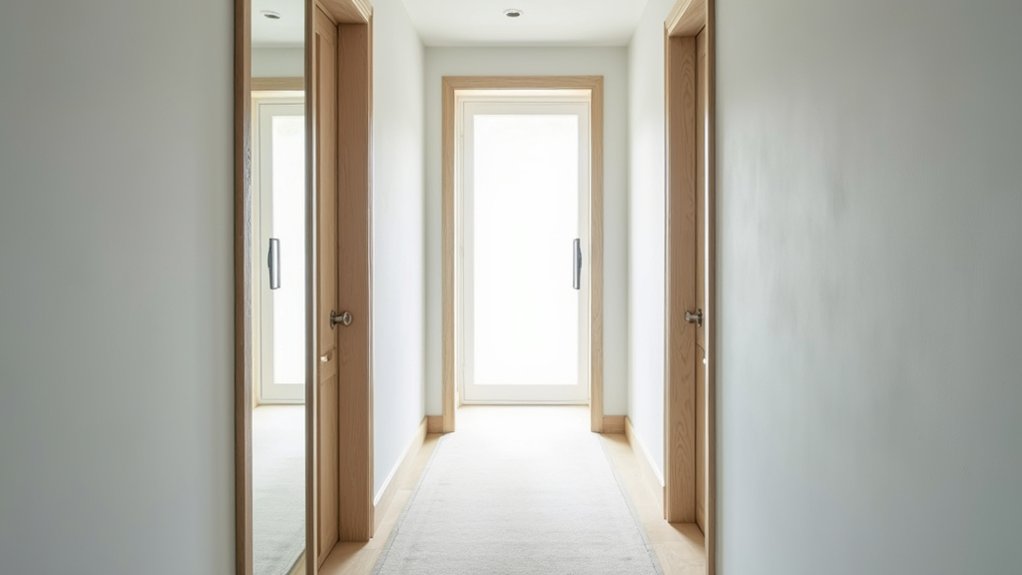
Picture a narrow hallway where the walls seem to inch inward every time you walk through. You can change that feeling fast with colour choices that push surfaces back, bounce light, and soften shadow lines—think cool undertones, light-reflective neutrals, and trim contrast that subtly widens the view. But the real shift comes from pairing the right shade with the right finish and ceiling move, because one wrong step can shrink it again…
Key Takeaways
- Choose light, low-contrast neutrals to reflect light, soften edges, and visually expand narrow hallway walls.
- Use balanced warm-leaning neutrals in low sunlight to reduce harsh shadows and keep the space feeling welcoming.
- Add cool undertones sparingly to create a receding effect, but avoid overly icy colours that can feel stark in dim halls.
- Blur boundaries by matching walls and trim closely in colour, using different sheens to maintain definition without narrowing contrast.
- Boost perceived space with eggshell or satin on walls and a ceiling 10–20% lighter in flat finish to increase height and brightness.
Best Narrow Hallway Paint Colours (Quick Picks)
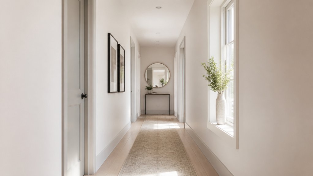
Wondering which paint colours instantly make a narrow hallway feel wider? Start with a light, low-contrast Color palette that bounces light and keeps edges visually soft.
Quick picks: warm off-white, clean white, and pale greige for an airy, modern baseline; soft dove gray for a sleek look without feeling stark; powdery blush-beige for subtle warmth; and misty sage or pale blue-gray for calm Mood enhancement.
If you want more depth, try a light mushroom or faded clay on walls and keep trim a step lighter to sharpen lines without closing the space.
Finish with an eggshell sheen for gentle reflectivity, and test swatches in both daylight and evening bulbs to confirm the effect.
Cool vs Warm Undertones in Hallway Colours
While light shades help a narrow hallway feel bigger, the undertone you choose—cool or warm—determines whether the space reads crisp and expansive or cozy and slightly enclosed.
Cool undertones (blue, green, violet-leaning whites and greiges) sharpen edges, bounce daylight, and create a “receding” effect—one of the key psychological effects that makes walls feel farther away. They also shift temperature perception cooler, which can feel airy but stark in low light.
Warm undertones (yellow, red, pink-beige) soften shadows and flatter skin tones, but they visually advance, so the corridor can feel tighter. If your hallway lacks sun, pick a balanced neutral with a gentle warm hint, not a golden base.
The Best Paint Finish for Hallways (Light + Durability)
Even if you’ve nailed the perfect hallway colour, the paint finish determines how much light the walls actually throw back—and how well they’ll survive daily scuffs.
For most narrow hallways, choose an eggshell or satin: both bounce light better than matte, yet hide minor dents and roller marks. Satin reflects more, so it amplifies smart lighting techniques like layered sconces plus a warm LED ceiling fixture.
If your hall gets heavy traffic, go scrub-able, stain-resistant formulas and consider a higher-sheen washable enamel on the lower wall zone where bags and shoes graze.
Keep ceilings flat to avoid glare.
Coordinate furniture placement too: slim consoles and wall hooks reduce contact points, so your finish stays crisp longer and looks brighter daily.
Use Trim and Contrast to Make Hallways Look Wider
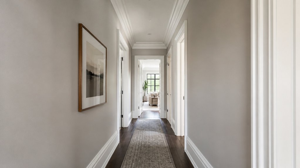
If your hallway still feels tight after choosing the right wall colour and finish, you can “push” the walls outward visually by using trim and contrast strategically. Paint baseboards, door casings, and any panel moulding a crisp, light shade (warm white, soft greige, or the palest version of your wall colour) to create clean edges that read as extra width.
For modern homes, try low-contrast walls and trim (same colour, different sheen) to blur boundaries and boost visual expansion.
Want a bolder, designer look? Flip it: keep walls light and pick slightly deeper trim for graphic framing—just stay within one undertone.
Match vents, switches, and door faces to the wall to reduce visual clutter, and keep lines continuous down the run.
Ceiling Colour Tricks to Make Hallways Feel Taller
Because your eye reads the ceiling as the “limit” of the space, a smart ceiling colour choice can make a narrow hallway feel noticeably taller. Paint it 10–20% lighter than the walls to lift the plane without creating a harsh line.
If you’ve got white walls, try a soft warm white overhead rather than bright blue-white, which can feel flat.
For color layering, run the wall colour up onto the ceiling by 2–4 inches (or paint the crown moulding to match) to blur the boundary and stretch height.
A satin or matte finish hides seams; avoid high gloss unless you want deliberate lighting illusions from reflected hotspots.
In low light, choose a ceiling shade with a higher LRV to keep it airy.
Add Depth With an Accent, Art, and Lighting
While a narrow hallway doesn’t give you much floor area to work with, you can still create a sense of depth by controlling where the eye lands: add a single accent (like a darker end wall, a slim runner, or a painted arch), then layer in art at eye level and finish with lighting that “washes” the walls rather than spotlighting the center.
Keep your Colour palette tight: one main wall colour, one accent tone, and one metal finish, so the space reads long and calm.
Choose Artistic accents with vertical shapes—stacked frames, a tall print, or a narrow mirror—to pull sightlines forward. Hang pieces 57–60 inches from the floor to center them.
Use sconces or LED strips aimed outward to bounce light across paint, revealing texture and making walls feel farther apart.
Hallway Colour Mistakes That Make Spaces Feel Smaller
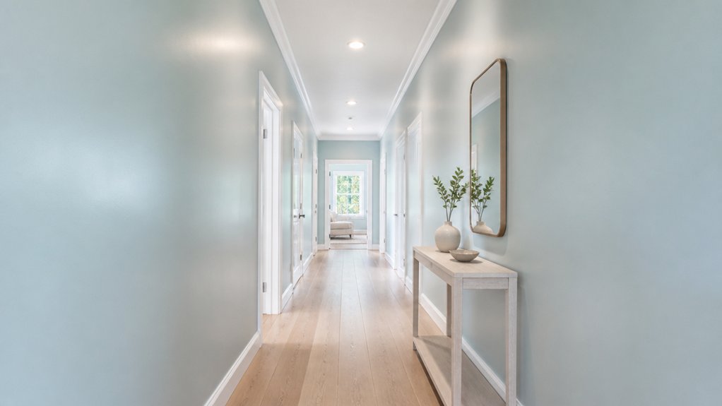
Once you’ve used a focused accent, eye-level art, and wall-washing light to stretch a narrow hallway visually, the fastest way to undo that work is with the wrong paint choices.
The biggest hallway colour mistakes start with going too dark on both walls and ceiling, which collapses height and shortens sightlines. High-contrast trims (bright white against deep colour) can “box in” the corridor; try a softened trim shade or a satin finish close to the wall colour.
Avoid cool, flat greys in low light—they read muddy and shrinky. Also skip busy, multicolour walls that chop the run into segments.
For space enhancing colour choices, keep undertones consistent, push ceilings one step lighter, and use warm off-whites or light greige with a gentle sheen.
Conclusion
Paint your narrow hallway like it’s auditioning for “Most Improved Square Footage.” You’ll pick a light, reflective shade (soft white, pale greige, misty green), lean cool if you want walls to “politely retreat,” or go warm blush to hush harsh shadows. Use a durable eggshell, keep trim lighter for crisp width, and sneak the wall colour onto the ceiling for extra height. Add one smart accent and good lighting—then stop painting it cave-black.
About the Author